What’s the best online business to start in 2020?

A male and a female business owners stood in a shop looking at a tablet device. Both are wearing aprons and smiling

This is the year you start your own successful online business! You’re looking for freedom, cash flow and an escape from the 9-5 commuter grind – but first, you need to decide on a business idea. 

Start a blog and monetise it

What could you talk about for hours on end? Try starting a blog on a subject you’re interested in. It’s not quite as easy as it sounds though, as you’ll have to consistently publish content that engages users to develop a solid following. Once you’ve got this though, you can start earning money through affiliate marketing or advertising. 

Affiliate marketing is where you earn a commission by promoting products through your blog. It’s useful to have a basic knowledge of SEO and copywriting for this (here’s a good beginner’s guide from SEO Moz), and you’ll get better results promoting content that is similar to your blog to start with. Amazon’s affiliate program has a list of products you can advertise if you’re stuck for ideas. 

You can also make money by selling advert space on your blog, but to get a decent income you have to have millions of viewers. It’s a good side hustle, but don’t expect it to become your main form of income. 

Coaching and online courses

If you have a good level of expertise in a certain subject, you can monetise it! You will have to promote it yourself through a website, social media and email lists, and it’s often useful to have a blog related to your subject of expertise to give yourself more credibility. 

Online coaching involves few clients, but at a high hourly rate. It’s a quick way to start earning money fast, and you can charge premium prices – but make sure to do some market research to set your price. 

Online courses are low risk, high reward ventures. They are easily scalable and can reach a global audience, and as they don’t have a sell-by date, they can make money over time with minimal input from you. 

Ecommerce

You’ll need to do your research to find a profitable market first, with steady growth, and it’s best to keep your idea specific rather than general to give yourself an edge. 

There are lots of costs involved in ecommerce, so make sure your product costs at least £50, if not more, otherwise you might find you aren’t making any profit at all! A cheaper option is to use dropshipping, where the products are held and sent by the supplier rather than you. 

To set up a profitable and successful online business, go into something you care about and you have a good level of knowledge on. And for each of these options, a website is paramount. Try Go Sitebuilder’s simple website creator with our free 14-day trial and start your online business today! 

What is crucial for effective website design?

A man and a woman standing over a table looking at a piece of paper. The male is wearing a casual denim shirt and holding a pen. The female is wearing a white t-shirt and is standing slightly in the background

A beautiful website will leave a great impression. There are a lot of different directions you can adventure into when designing a new website. We’ve put our heads together to give you this easy to follow list that will help you create the most effective website design.

Keep it simple

You could be forgiven for thinking that the more you add to your website, the better the experience for your audiences. But, there is a fine line between being informative and causing confusion or clutter. Simplicity is the way to go.

Use your space to say what you need to say, but don’t go overboard. Keep your colour palettes, fonts and other design elements clean, minimalist and simple. Not only will this create a sleek design but it will also make it easy for the viewer to digest the information. And, don’t be afraid of the white or blank spaces on your site. These are actually important design elements in their own right.

Use logical navigation

Try to view your website like taking a journey, in that there should be a logical path to follow to get from A to B. Straightforward navigation is a vital component of any website because it enables viewers to easily find the information they’re looking for. If your site lacks cohesion, some visitors may be left wondering where they’re supposed to go.

Your menu bars and page layouts are key to providing clear navigation, but you should also include easy-to-understand calls to actions so that viewers know what to expect or do next. You can easily lead them exactly where you want them to go!

Try out visual media

Cramming your website with text could be hard for your viewers, so think carefully about how you present your written information. Ideally, your text should be easily scannable, so time-starved viewers can still easily find the information they need.

Quick tip: Use lists and bullet points, for example, to break chunks of text up.

Another essential strategy to break text up is to include visual media on your site. Images speak louder than words so they’re a really important asset to your site to promote your products or services. Ideally, use your own photos, but whether you use originals or stock images make sure they’re of good quality – you don’t want a blurry, oversized image to be representing your business.

Responsive design

Effective website design involves enabling the site to be compatible for use on a range of devices, including smartphones, tablets and desktop computers. If you’ve already got a Go Sitebuilder website you won’t need to worry about responsive design as everything you create is instantly responsive!

Responsive design, in a nutshell, means that your website will adjust in size to suit a particular device. This leaves your content clear and easy to read no matter what device it’s viewed upon. With many internet users now relying exclusively on smartphones for web viewing, this is a design element that is nowadays a necessity rather than a luxury if you don’t want to miss a potential audience!

You don’t have to be a professional designer to build a website with Go Sitebuilder. Our hand-crafted, beautiful website sections will have you online within minutes – so what are you waiting for? Get online today with a 14-day free trial!

3 ways to find an online start-up business partner

Birds eye view of two females sat down at a table drinking tea. A doughnut is also on the table.

Starting an online business can be extremely exciting, confusing and scary at the same time. With all of these feelings along with the list of tasks you need to check off, a business partner could be exactly what you need. We know that things are always better with a friend by your side, even in the world of business. Finding another entrepreneur or sometimes even a group of entrepreneurs is always a great way of beginning your start-up. But, how do you meet them? How can you find people who share the same interests as you, along with the passion for business? It may seem hard, but we’re here to break it down. We’ve compiled a helpful list with 3 ways to assist you in finding your new online start-up business partner!

1. Make use of social media

Social media has never been bigger. There’s an estimated 3 billion of us using it each day. With so many people out there, it is highly likely that there is another person on the internet with the same business idea as you who would also be willing to look to partner up.

But how do you find them?

Hashtags! And use lots of them! Taking advantage of hashtags by using and following your interests/business ideas is a great way of connecting to people like you. You can search for other people using the hashtags along with posting them yourself. Try using some generalised ones such as #startupbusiness or #buddingentrepreneur, as well as a mix of hashtags that relate to your business idea.

Once you’ve found someone who clearly shares the same love for your business idea as you, try sending them a direct message saying you are looking to connect with other entrepreneurs – you never know where it could lead you.

2. Forums

Forums are there to connect groups of people who share the same likes and interests on large group chat-style websites. There is a forum for everything and even whole websites that focus on one specific idea.
Try searching for a forum surrounding your business approach and make a post, asking if anyone is interested in setting up an online start-up business. You could find your next business partner on the other side of the world!

3. Local listing pages

There are plenty of websites on the internet that offer a service similar to a digital AA pages book. Some of these are free to post on, allowing you to put out a search for other entrepreneurs who may be interested in starting a business with you, or who may know someone else who is looking for a business partner. And, if you’ve posted a free advert, it’s not as though you’ve lost anything in doing it!

So there you have it – 3 easy ways to start connecting with possible business partners! With the internet so vast and full of different interests and personalities, there’s never been more opportunity to find people who could help you take your start-up online business to the next level. If you still haven’t got your business online, now is a perfect time! Try Go Sitebuilder free for 14-days and see just how easy it is to get your website up and running.

What are the 5 best electrician website designs

An electrician standing on an extended cherry picker raising his arm towards a telegraph pole in the distance

Electrician websites are all over the internet, but there are some that truly stand out from the crowd. It can pay to examine what these businesses are doing that is working so well, so that you can emulate some principles and make them your own.

Website Templates for Electricians
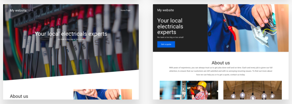
One of Go Sitebuilder’s easy-to-use website builder templates

Here are some of the best in the world of electrician website designs for you to take a look at:

1. Teague Electric

Despite being a large company, Teague Electric prides itself on offering a personal service to its clients. Their website stands out with its playful background image and easy access to their latest blog posts. They have also carefully cropped their header photos to match their logo, adding real power to the branding. Note the Facebook badge and Twitter Feed at the bottom, calling attention to their social media.

2. Moran Electrical Contracting

This website stands out due to the quality of the photography throughout. This looks professional and makes the website attractive. They also list their specific service pages very well, making it very clear how they can help their customers. The inclusion of testimonials is also a great credibility piece.

3. Withrow Electric

This is a small, family-owned business that offers superb customer service and will take on any job, regardless of size. The bright colour pallet of their website immediately stands out to grab the visitor’s attention. The employee photos make the team feel friendly and approachable, and the company branding is really spot-on. Additionally, the cropped circular images give a distinctly modern feel.

4. Hardt Electric Inc.

This electrician website design feels very contemporary. It utilises modern fonts to make the text work as a part of the visual design. It is full of quality pictures, neatly organised and without making the site slow or clunky. The completed project gallery is a good tool to help customers see what they can do.

5. Weifield Group

This website displays company milestones that really call attention to the high standards they achieve. The crew of the month is a nice way of further emphasising the company’s focus on doing the best they can. The introductory videos are another great draw for traffic, and the ability to roll-over zoom on the photos makes it feel up to date.

It’s a good idea to stay abreast of website trends, particularly for sites in your niche. There are a lot of resources for this online, and at Go Sitebuilder we provide a website builder designed for businesses like yours – try it for free today.

Make your brand stand out by using some of these fantastic additions that the websites listed here have executed, and share your own website with the world.

How do I launch a new website on social media?

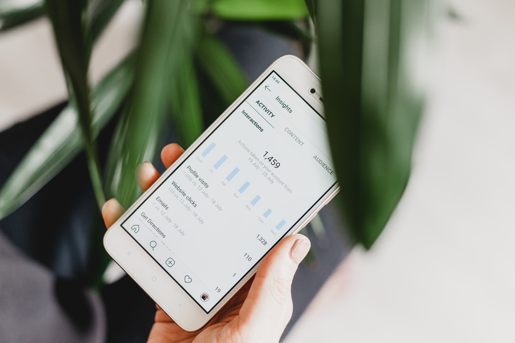
Close up of a mobile phone displaying some social media analytics. A green plant is in the foreground and background.

Whether you’re an established small business or you’re fresh off the starting blocks, in today’s world it all starts with a website. From there, it’s about getting the word out – and what better way than social media? It may seem like a simple case of creating a few profiles and watching the likes roll in, but the reality can be quite different. So, if you’re asking yourself how to launch your new website on social media, this quick guide is for you!

Step 1: Create your brand identity

One of the most common mistakes new businesses make when launching a social media presence is failing to stand out. With so many companies now utilising social media as a core marketing channel, it’s more important than ever to develop a true brand identity. Throwing a logo together in Microsoft Word simply won’t cut it, so be sure to take some time to build a brand that is visually consistent, engaging, and instantly recognisable – then update your profiles so they all reflect it. Be creative and choose a strategy that really represents your business and its values.

Step 2: Build a social media launch plan

Once you’re happy with the overall look of your profiles, it’s time to consider the ‘meat’ of your social media strategy – the content. Put simply, you can’t expect to set a page live and then see the follower numbers immediately skyrocket – it doesn’t always work that way. So, in order to support your launch, you’ll need to prepare the content you’ll be posting in the first weeks, or even months, of your new social profiles. This content could be blog posts on your new website (a great way to build traffic), videos, images (even fun things like memes), infographics, and so on.

Step 3: Incentivising new followers (the right way)

Okay, so let’s assume you’re up and running and you’re following a content calendar to drive visitors from your social channels to your website. What’s next? Well, you want those numbers to go up, of course! As we explained, the “build it and they will come” approach doesn’t work in today’s world. The key to building a social following for your website is incentivisation, at least at the beginning. These incentives can be anything you like, but one great option is to hold giveaways for small things (like gift vouchers) which won’t cost much but will drive engagement. Just don’t forget to ask people to like and follow to enter!

We hope this quick guide will help you hit the ground running when it comes to launching your website on social media. Of course, if you’re still in the early stages of launching your business and you haven’t yet built a website, there’s no better place to start than with our 14-day free trial of Go Sitebuilder.

What are the best digital marketing launch strategies?

Male sitting at a desk next to a large vase of pink flowers. He is wearing a dark blue shirt and using a laptop

Launching your website creates a new, exciting opportunity for your business. It’s your chance to share your unique story with the world and start growing your business online. Launch day is an opportunity to get people talking about your site so make sure you capitalise on this with a great launch strategy.

But what makes a great marketing launch strategy? The first thing to do is to choose a suitable domain name. Using a professional domain name is a must for any successful launch strategy since an individualised domain name is more likely to be memorable to the new website user. That’s why Go Sitebuilder includes a free domain name with every subscription: helping to get your new website off the ground! Once you’ve got that covered you’re ready to head onto the next steps…

Start early:

Planning for the big day should start well ahead of your launch date, even before you have finalised the website design on your website builder. Your top priority is to start collecting emails, so start getting the word out on social media, or other channels, and get people to opt-in to your updates. Keep in touch with these people via email, introducing them to key features on the coming website. This will keep the launch day exciting for customers, and keep your business in everyone’s minds.

Create anticipation:

Whether you have an existing customer base or you are using your website to create a completely new brand, it is really important that you emphasise the anticipation in the lead up to launch day. One way to do this is to offer a private, early look at your new website. This is a valuable VIP-type teaser, but it is also a great way to create loyalty to your brand – right from the word Go!

Capitalise on new users:

Launch day is often the biggest day of traffic in the first year of trading. So, it’s really important to prolong the impact of all those extra users. One way to make sure users continue to spread the word about your new website, even after launch day, is to introduce a referral scheme. A referral scheme will offer a reward to customers if they send a friend the link to your launch page and that friend types in their email. This is a really effective way to make sure news about your newly launched website travels.

Having a website is crucial for every business. If you haven’t created yours yet, why don’t you check out Go Sitebuilder? Create your website from anywhere without the need for any technical skills. Try Go Sitebuilder free for 14-days to see just how easy it is to get your business online.

4 fool-proof ways to drive traffic to your new website

Launching a website

There’s nothing quite like launching a fresh, new website – especially as a small or new business. After all, your website is part of your public image and your most important digital marketing asset. But, what happens after you’ve hit the publish button?

Your traffic can, and will, grow organically once your site is online but it’s likely to take a long time for you to see the growth you’re really looking for without boosting it yourself. Thankfully, there’s a wealth of easy-to-follow options for driving traffic to your website. We’ve explored some of these options below:

Option #1: Work on your Search Engine Optimisation (SEO)

Search Engine Optimisation, or SEO, is the heart of any solid digital strategy. Put simply, it’s a staple of on-page and off-page techniques which can help you bring organic (i.e. not paid) traffic to your website. Quality SEO will bring your website higher in the search results when users look for your target keywords, meaning more traffic for you. It sounds scary and complicated but this easy to follow guide will get you started on the basics. Once you understand the basics, keeping your website up to date with fresh content is the best way to play your SEO-game!

Option #2: Create a content strategy

Another great way to keep people coming back to your website is to frequently publish interesting and engaging content. In fact, a solid content strategy is really the backbone of successful digital marketing. The great thing about content production is that it’s low-cost (or free if you’re willing to put pen to paper) and easy to do if you leverage your industry knowledge. Create a plan of the types of content you think your visitors would find interesting or useful and set up a calendar for when you want to post each article or page.

Option #3: Explore the world of guest blogging

Here’s a method of traffic generation which can bring traffic to your site in two different ways. By doing a little outreach and working with related websites, you can arrange guest blog posts whereby you write some content for them, and they allow you to link back to your website. Not only will this bring relevant traffic to your site, but it’ll also generate backlinks which are an essential ingredient to quality SEO.

Option #4: If you’re in a rush, try some paid ads

While the strategies we’ve shared so far are all proven and effective, they can take a little time to reap the traffic rewards. SEO, for example, can take a few weeks or even months to start showing positive results. If you need traffic faster than this, PPC (Pay Per Click) advertising is always an option. With a program like Google Ads or Facebook Ads, you can bid a small amount of money to place your ad higher up in the search results. It can be a great way to give your new business a jumpstart.

If you’re having trouble driving traffic to your website, try out one or more of these ideas and you’ll soon start to see some positive results. And if you’re yet to build the website of your dreams, why not try out Go Sitebuilder today? It’s the easiest way to create a professional website for your business – no technical skills required!

What are the best new website launch campaigns?

Website launch campaigns

Are you nearing the end of creating your very first website or perhaps a website redesign? Have you thought about how you’re going to share your beautiful new site with the world?

The best way to introduce your stylish new website design is with a website launch campaign. A great launch campaign can help new and existing customers discover your business website and start turning visitors into customers.

Website launch campaign using Go Sitebuilders website builder

What is a website launch campaign?

But what is it? A website launch campaign is simply a communications marketing strategy to introduce a website launch. It generally consists of messaging before the launch as well as after to generate traffic to the new website. Something all successful strategies have in common is that they are responsive to changing website traffic. A great way to ensure you can be flexible in responding to customer needs is to use a website builder that allows you to create and update your website via your smartphone. But this isn’t the only important strategy!

Our experts take a look at some of the most successful strategies for introducing your newly launched website:

Special discounts

A special offers themed launch campaign is highly effective at bringing in new and old customers alike. It is a particularly popular approach with e-commerce sites, where there are ample opportunities to encourage users to complete an action of value. Some customers will actively seek out websites that offer these discounts (like free shipping or 20% off) which make for a highly effective website launch.

Competitions

Everyone loves the opportunity to win something, and this can be used positively in a website launch campaign. A well-run competition can do more than introduce users to your new website, it can also encourage your visitors to check out key pages on your website. For example, you might run a website scavenger hunt. This offers visitors the chance to win a prize or discount, whilst ensuring that they explore pages of your website – driving people to read, click and interact with your new site. 

Showcasing content

It is really important that you think about the content that you want your visitors to see during your website launch. Do you want them to understand more about your business and brand story, or is it more important that they view your products straight away? Whatever your goal, users rarely explore the full website themselves, so make sure you highlight important content and pages.

Two popular ways of doing this are to either:

  1. Create a showcasing video of the important new content
  2. Create a landing page dedicated to the launch of your new website. The landing page could highlight all of the important content you want people to see and drive them to click through to other pages of your website.
Homepage of a website launch using Go Sitebuilders website builder

These are just some of the great campaign tactics you can consider when launching your website. Even if you decide to try other types of campaigns, remember it’s always important to take a step back and give yourself some time between finishing your website and sharing it with the world!

“Lots of my customers have commented on how easy it was to find and use my website – that wouldn’t be possible without Go Sitebuilder and my own domain name.”

Polly Evans – pollyevanshypnotherapy.com

If you still haven’t created your dream site or are thinking of starting something newtry Go Sitebuilder free for 14-days and see just how easy it is to build your own website with no technical skills needed!

3 inspiring event website designs and must-have features

Events websites

Are you looking to create a stand-out events website? If you’re starting from scratch, or simply looking to freshen up an existing website, it’s a good idea take a look at some of the industry’s best for design and content inspiration. Check out three of the UK’s biggest event websites below:

1. Glastonbury Festival

As soon as you visit the Glastonbury website, you are greeted by the warm colours that beam from their header image. With the infamous landscape and sunset design – the graphic is a mirage of what attendees can expect to enjoy in the summer.

Below this, you are drawn to a rainbow of uneven and clickable menu headings, each a little imperfect, replicating the colourful event shacks that attendees will see during their time at the festival. This is a great way to display consistency, letting the website viewers get an idea on what to expect at the actual event.

The colours and art style create a ‘Glastonbury vibe’, giving you an insight into the place where you’ll be wanting to spend a few warm summer evenings. The homepage clearly highlights all the upcoming artists for the years festival, teasing users to what is in store. It’s easy at first glance to be excited, so it’s clear why so many people click straight to the ‘shop’ icon.


Another great feature on the Glastonbury website is the access information page. It features a very recognisable hero image of different disability awareness symbols; a quick and friendly way to show users that they are an all-inclusive event. The access page has a larger font for those with limited visibility and information on how to get into contact with the team with any queries.

2. The Jockey Club – Grand National 2020

Separated by an array of tonal grey boxes, the Jockey Club website is easy to navigate thanks to its simplicity.

Firstly, the heading for each tab is written in capitals, with a contrasting font against the background to get your attention. Each event tab also features key dates, itinerary and various package options. The information is displayed neatly and effectively. This creates an easy to navigate customer journey, allowing the user to find the information they are looking for. The Jockey Club’s website has been broken up in a way that is easy to understand. They have achieved this by using a comfortable amount of white space along with H1, H2, H3 headings. Their content starts with catchy headings, followed by slightly more information, and then an area which allows users to read in-depth about the event. This is a classic strategy with many benefits – but key in getting people to read your website.

3. Social Media Week London

Another exceptional website for events is Social Media Week London. It has a tasteful colour palette with a pop. The website makes great use of white space and grey/lilac tones to draw users to key bits of information.

On their homepage, they use icons to create an easy and effective way to convey information to the site users; such as a globe icon with ’20+ countries’ for people to recognise that this is a global event. Not only is this a great form of quick communication, but it also ties in together with their look and feel.

If you select the three-line menu navigation, a simple plain red pop up filters in front of the page, with short and snappy headings for you to click on, making for easy navigation.
Finally, they use a running banner which scrolls along with the website, which – if you are running an event with sponsors – is a great way to promote them and show potential attendees who may be coming!

So there you have it, our top 3 event website designs and their top features. If you’re looking to construct an eye-catching event website quickly, easily and affordably then start a free trial with Go Sitebuilder – no credit card or technical skills required!