What should be considered when designing a financial website?

small business owner looking at laptop designing her of a financial website on Go Sitebuilder

A financial website may seem more challenging than websites for other, more creative industries. This is because you need to balance style with stability, and show authority in your field while still being approachable. Sound daunting? Don’t worry, we’ve put together some ideas that will help you design the best financial website for your company! 

Colour theme

A good colour theme is paramount when designing your financial website. Often, website builders will have built-in colour palettes that you can use, which makes life easier because you already know that these colours will complement each other. However, even though a pink-and-yellow colour theme might be a good idea for an events website or a clothing brand, it might not evoke the right response from your target audience.

The most common colour scheme for a financial website is blue and white. To stand out from the crowd while maintaining a refined and modern look, a monochrome colour scheme is also a good design choice, but make sure it isn’t dull by adding high quality images, or even adding a pop of colour in the navigation bar or logo. 

Blue indicates serenity and security, whereas black offers more authority and solidity. Adding a warm colour like rust or muted orange evokes the idea of home, stability and being down to earth. If your logo has a specific colour that fits into one of these themes, you can create a colour palette around it using a colour palette tool such as Coolors. When choosing a colour scheme, remember less is more; it’s best to have two complementing colours than adding four or five clashing ones, resulting in a mismatched and unprofessional-looking website.

Appeal to your target audience

Making sure your services appeal to your target audience is key to any successful financial company, and this is something you can easily show when building your website. Create an audience persona, thinking about their age, financial position and life goals and tailor your services towards them. A great way to instantly reach out to your target audience is to have an image of people that fit your buyer persona on the homepage; if people arrive on your site and immediately relate with the image, then they are more likely to explore the website further. 

If you are targeting people who have no previous experience in financial matters and may find approaching a financial company daunting, then why not present your services in the clearest way possible? Creating infographics or flow charts that visually explain what you do and how you do it will help your potential customer feel secure, as they know exactly what to expect. 

Is there a ready to go template for a financial website?

If you don’t want to get bogged down in website design, then you can find a website builder that has ready to go website design templates. This means you can just choose a template and input information about your company, letting the website builder take care of the images and the colour scheme. Go Sitebuilder has templates ready designed for a host of industries, including the financial sector, so you can have a website up and running in a few minutes. If you’re not 100% happy with the template, you can move things around, change colours and add new images until you have a website you love.

How important is website design for financial businesses?

A website isn’t just a pretty face – it’s also a supremely important online marketing tool. A good financial website design will incite your visitors to stay on your site and do more research on the services you provide, hopefully converting into paying customers. The more professional and eye-catching your website is, the more likely this is to happen. 

It is also a great way to prove to your customers that you are a leader in your field. Many financial companies have newsletters or information on general financial queries that potential customers can access for free or by signing up with their email. 

According to a survey by marketing solutions company Blue Corona, 83% of consumers said that website user experience is important when choosing a financial services company. Having your own website both makes you more visible to customers – most of whom carry out initial research online – and makes it more likely for them to stay on your site and request your services. 

If you think your financial services company could benefit from a website but you don’t have the time to curate one from scratch, then try Go Sitebuilder. Our website builder is designed to be as simple and time-efficient as possible, so you don’t have to spend hours designing before you start to see the results. Try our 14-day free trial today, and see what your financial business could look like on the web. 

What Are the Best Ways to Promote a New Law Firm Online

Young lawyer woman showing information on laptop to businessman. Lawyer explaining Best Ways to Promote a New Law Firm Online together in modern office.

The internet is an invaluable tool when it comes to promoting your services. However, it is important to know exactly how to utilise what the online world offers to ensure you don’t sink under numerous other websites. Promoting your law firm online is a fantastic way to increase visibility for your business: considering that word of mouth isn’t so reliable nowadays, having a strong website which entices potential clients can be key to your success. 

Appealing web design 

Whilst image isn’t everything, it certainly makes an impression on whoever visits your site. Even if you have the most knowledge in the field, or have an impressive list of past achievements, most people are likely to disregard any information and click off the site if it is cluttered and unclear. An aesthetic web design is key in making site visitors want to stay on, enabling them to read more into what your law firm offers. GoodFirms’ research revealed that the biggest mistake most make when designing a website is to overcrowd it, so keep your design fairly minimal, but in a way which is sleek and attractive. 

Having a visually appealing web design also tells the site user that you’re a professional. As your design should emulate what kind of service you’re providing, having a sophisticated website means the site user can see that you’re serious about providing quality results. If your design is all over the place with font sizes, colours and images then a site user is much more likely going to be put off, as they may think your business is a bit amateur. 

Accessibility 

You want people to be able to access your site without any hassle. Considering most people have a very low threshold when it comes to being patient on the internet (47% expect a website to load in under 3 seconds), it is key that you make the experience on your site as smooth as possible. A slow website isn’t appealing to anyone: if your site takes too long to load then traffic could simply click off before they’ve even seen what you have to offer. 

Having a website which people can access on any device is also paramount. Considering that 57% of site traffic is from a mobile, it is highly likely that people will be viewing your website from on a handheld device. If your website is difficult to navigate on certain devices then you won’t be able to effectively promote your law firm online. As many will be searching for information about your firm whilst they’re on the go, having a site that can be accessed anywhere is extremely beneficial. Go Sitebuilder has made sure compatibility is a key component of our website builder, and you can see what the website will look like on mobile and tablet just with the click of a button.

Set aside time for blogging

Blogging isn’t that hobby that only 14 year old wanna-be influencers do; it can actually be a valuable addition to your website. Blogging improves SEO – search engine optimisation – results: by including commonly googled keywords within your blogs, Google is much more likely to find that your content is of value. It then ranks you higher on search engine results, meaning that people are more likely to click onto your blog, and then explore what else you have to offer. 

You can also include internal links within your blogs, either to other relevant pages of your website, or another blogpost which provides even more information with regards to the topic in discussion. Internal links are important for SEO as it spreadings ranking power throughout your site, meaning that other parts of your website can also gain a better ranking on search engine results. 

Although it might push you outside your comfort zone slightly, blogging is a fantastic way to promote your services, completely free of charge. If you manage to keep up with writing posts, then every time you publish a blog Google will reindex your page – in other words, every blog post written prompts Google to look back over your content and, as long as your content is useful, it will rank you higher on its search engine.

Don’t ignore social media 

As probably one of the best ways to promote your new law firm, social media lets you advertise your services for free. Linking your social media to your website leads site users to a more personal aspect of your business. Twitter, Facebook, Instagram: all are great ways to connect with your customers. It can also be an easier way for potential clients to approach you, should they have any questions that they want a swift answer to. 

By utilising your social media accounts effectively, you can visually market yourself and your services to others. For example, say you want to post a video explaining what you have to offer, then Instagram is a great platform to use to reach out to others. Or, if you want to generate some conversation, sharing one of your blogs to your Facebook page is an easy way to spark interest amongst others. 

Although building a website might seem like a daunting prospect, Go Sitebuilder is one of the best site builders in the UK for those who don’t have hours to spare on coding a new website from scratch. It is incredibly easy to use, compatible with mobiles and and tables, and has ready to go tools available so that you can have a fully optimised website available in hours. Their 14-day free trial gives you all the flexibility you need to promote your new law firm online.

What are 10 things I should know before I open an online store

Happy woman doing online shopping at home using an online shop

Your fingers hover above your mouse, ready to make that final click so that you can start your online business. However, before you rush to start up your online store, there are a few things that need to be considered first. Just like everything, having some form of plan or method behind your website building can make the process a lot smoother and easy to manage. Luckily, the level of planning you need to do isn’t rocket science: we’ve put together 10 things that you should know before you start up your online store.   

Blog, blog, and blog some more

Blogging is an incredibly useful way for you to become visible on the internet: if done correctly, it can increase your Google rankings by 434%! By using keywords in your blog, Google’s algorithms can index your site highly on its search engines, as it can see that your content is useful. 

By writing new blogs each week, Google repeatedly reindexes your site: it’s a bit like always reminding Google that your content is of high value, and that it should be ranked highly on its search engines. 

Focus on the customer 

Really consider what your audience wants. Of course, you will have built your business with a service in mind, but really think about who you want to target. For example, if you’re setting up a website for your yoga classes consider ways to appeal to your target audience. Is there an age range which is more likely to attend your classes? Is there a certain niche that your online business can fall into? Considering these factors will help you tailor both your website design and the services you offer, so that you can reach out to your target audience online. 

Less is more 

You don’t need to be a professional website designer to build your own site with a visually appealing look – keeping the simple mantra of ‘less is more’ in mind can ensure you end up with an aesthetic site which anyone would want to stay on. Considering that 38% of people will be put off your website if it is unattractive, focusing on your website design is incredibly important. 

However, this doesn’t mean you should cram your site with countless different fonts or images: having a simple, sleek design is the best way for you to appear professional, and attract the user to your online store. Luckily. Go Sitebuilder makes the design process extremely easy: our ready to go website designs allow you to create your dream website within a few clicks. 

Navigation is key

Once a user clicks on your website, they want to be able to find all the necessary information within a few minutes. By making your headers easy to read, and increasing the font size of the key bits of information, the user can navigate themselves easily around the website. When building your website, try to include an FAQ section – this provides quick answers to common questions, and stops your inbox from being inundated with unnecessary questions.

Choose your domain name wisely

Having a unique domain name is the only way that people can find you. It’s important to get creative here – using a domain name that’s individual to you means that people are much more likely to identify with your brand and your website. Our website builder makes creating a domain name incredibly simple or, if you already have an existing domain name, you can easily transfer this over to our site builder. 

Don’t ignore social media

Considering that 90% of Instagram users follow a business, not utilising social media could be damaging to your company. Linking your social media platforms to your website means that you can create a personal, direct way to reach out to your current customers, as frequent posting of deals or latest updates constantly refreshes your image within their minds. 

Sort an email list

Being able to put together an email list is another personal way to reach out to your customers. You can encourage them to sign up to your email list by offering them high value content in return, such as first updates on special deals, or a free ebook. By emailing your customers each week, you keep them conscious of your website, and capture their interest, making them more likely to return to your site. 

Be active

Constantly updating your site so that it fits in with the latest trends, or has the most recent information is key, as it tells Google that your content is still relevant, meaning it is important for SEO (search engine optimisation) purposes. 

Actively working to fix any bugs or issues within your site is also key: if your site takes too long to load, then people are more likely to click off. This can be damaging for your online store: considering that 40% of people abandon a website entirely if it takes longer than three seconds to load, you want to stay active on your website to ensure any problems are ironed out straight away.

Product descriptions are important

Just like blogs, product descriptions are another way to include keywords within your site, which is great for SEO purposes. By including the keywords within product description, your product is more likely to be highly indexed by Google, as you’re essentially telling Google that your product is relevant to whatever is being searched.

Prioritise your landing page 

Your landing page is the first page that everyone sees, which is why it must be strong. Not only does it need a striking website design, but it also needs to include most of the keywords that your business can rank on. This ensures your homepage is more likely to come up in Google’s search engine when someone searches the type of service you provide.

Although it is key that you consider these steps, you don’t have to start from complete scratch if you want to build your own website: our website builder has everything you need, and more, to create an online store perfect for you. And, with our free 14-day trial, you have all the freedom you could need to start designing your own site today!

What makes a website user friendly?

Business woman using laptop in office viewing a friendly Go Sitebuilder website

When was the last time you visited a website and had no idea what the company was offering? Maybe you clicked around to find some more information, but, failing to do so, clicked away in exasperation. This is exactly what you don’t want to happen with your website. Let’s look at how you can apply our website design tips to ensure your visitors have the best possible user experience when they visit your site. 

What is UX design?

UX design, or user experience design, is a type of website design that contemplates how a user feels when they visit a website for the first time. This can include ease of use, efficiency in performing tasks, and how useful the site is for them. When building your website with UX design in mind, you need to make sure your website answer three key questions, the why, the what and the how of your product:

Why should your customers want to use your product?

What can customers do with your product and what is its functionality and features?

How can they buy or access the product?

If your website can answer these questions quickly and efficiently, then your user will enjoy the experience they have on your site. This makes it more likely for them to convert into a customer, recommend your site to others and have a positive first impression of your company. 

Why is UX design important?

If you have good UX design, then your users are more likely to have a positive experience with your company and therefore your product. In fact, according to HubSpot research, 75% of respondents stated that they thought ease of finding information is the most important element of a website. So, when you’re using your website builder and trying to work out a good website design, you need to put functionality and ease of use at the top. 

But how are you supposed to know what your users want in your website? Sports network ESPN decided to find out by asking their users what features and functionality they wanted on the site to improve the UX. By taking the suggestions on board and altering their website accordingly, they managed to increase their revenue by a staggering 35%.

It’s clear that a good UX design can have a huge effect on how your visitors view your site and how likely they are to convert into customers. 

How can you improve your UX?

The first step in making sure that your website design is optimised for good UX is to always have your audience in mind. Remember they’re not necessarily interested in the product you sell, but rather the problem your product will solve for them and the benefits this will have in their day-to-day lives. Make this clear, but don’t over explain.

Simplicity

Simplicity is key. We know it’s easy to think that the more bells and whistles you put on your website, the better it will be, but actually it just makes it more complicated for the user. Here at Go Sitebuilder we know this; that’s why our website builder has just the right amount of tools for you to create a professional-looking website with good user experience. No more, no less. When you think of adding another feature to your website, stop and think about what it will actually provide for your user. 

If you sell complex products, or a variety of different services and you’re struggling to keep the website simple, think about creating an interactive guide, or a helpful infographic that will help them decide quickly and easily what they need. Canva and Venngage are both free-to-use online infographic makers with ready-made templates so you can easily input your company’s information. 

Compatibility

Especially now, compatibility with a variety of browsers and devices is crucial to avoid putting people off. Recent research from Visual.ly shows that 85% of adults think that a mobile website should be as good or better than their desktop website, showing how much people value looking for information on the go. 

You can check what your site looks like on mobiles with Google mobile site tester, but it’s not that fast. If you choose Go Sitebuilder as your website builder, you can instantly see what your site looks like on mobile or tablet at the click of a button – all our website templates are compatible with all devices. 

Call to Action

Did you know that 70% of small businesses don’t have a Call to Action (CTA) on their homepage? This is the section that tells the user what to do, either to buy your product, to register for a free trial, or to contact you for more information. Without this, a visitor can feel directionless when they arrive at your site – you’re not answering the why, what or how questions they have. A CTA is easy to add; just make it short and snappy and put it on your homepage – make sure it stands out!

If you’re tempted to design your own website now but are still daunted by the prospect, then try Go Sitebuilder! We make your life easy by giving you ready to go templates, colour schemes, and font choices, and with our fully mobile-compatible website builder, you can design your website on the go! Try our free 14-day trial today to see what we have to offer.

How Can I Promote My Graphic Design Business?

Young people work in modern office discussing how to promote their graphic design business

There are many ways to promote your graphic design business to get the highest number of new customers. From social media to blog collaboration there are multiple options you can consider to increase the number of people who are aware of your business. Some of these options are more time consuming, whereas others are simple and efficient ways to increase your number of clients. Keep reading to find out more!

Social Media 

Social media can be one of the most effective ways to market your business. The volume of people you can reach easily through social media makes it one of the simplest marketing strategies for your business. However, you will not be the only graphic design firm to have an Instagram account. This means that you need to ensure that your posts are original and highly engaging. Some key aspects to think through when making social media content are: 

High Quality Images: You may want to showcase your work on social media with a post containing some of your graphic design content. This is very effective at showing the quality of your work, but you must ensure the images you post are high quality. 

The concentration of accounts on platforms such as Instagram and Facebook means that to compete you must post unique, interesting images to entice people to click on your profile and find out more. If you are new to social media check out this blog for tips for graphic designers. 

Up to Date Information: With any business having current information available is incredibly important. This should include information such as:

  • A short description of your business
  • Website link
  • Contact information
  • Address/location (if applicable)

Presence Across Platforms: A successful business will have a presence across many social media platforms. This increases the chance of more people finding your profile and therefore increases the chance of new customers. Platforms you should consider are: 

  • Instagram: a great platform for visually showing your work. Ensure to update regularly in order to get the most exposure across the site. 
  • Facebook: the most important aspect of your Facebook page should be to have up to date information and post regularly about your business.
  • Twitter: good for sharing news and photographs. Also useful for linking with other businesses and new clients. 
  • Linkedin: great for networking with new clients and other businesses.

The most important aspect across all these platforms is to have up to date information and make sure that they link back to your website.

Graphic Design Blog

A graphic design blog can allow you to showcase your best work and keep clients updated about changes or news in your business. Writing a blog can build a community around your business and allow more informal engagement with visitors to your website. Some aspects to consider are: 

  • The right website builder: one of the most important aspects in building a blog is finding the right website builder for you which allows you to create a professional blog without high costs. 
  • Creating regular content: ensure that you create content regularly so that your blog does not become detached from your business.
  • Making related content: the blogs you produce should be related to your business and have links to other sections of your website to encourage visitors to stay on your website. 

If you need more inspiration check out the best graphic design blogs for 2020.

Show Your Credentials 

A common mistake with many businesses is not showing off their achievements clearly on their website. By not clearly presenting your assets (such as awards or notable clients) you are not allowing clients to see you in the best light possible. Ensure to show these on the homepage of your website so that visitors can see them as soon as they enter your website. 

Collaborate with Others

By collaborating with others in the field you may gain more exposure through their website or social media channels. Find blogs that showcase graphic designers and contact them for interviews or guest articles – if you mention them in your work they are likely to share your content. Through collaboration with your peers and role models, your work can reach a larger audience and help spread awareness of your business and graphic design style. 

Strong Brand Image

An important aspect of any business is to have a strong brand image. In terms of promotion this relates to aspects such as a logo, colour scheme and brand ethos. These are all aspects of your business you should be absolutely certain of before trying to promote it. Once you have a strong brand image you can start to create business cards and email signatures, which can further promote your business.

Ready to promote your graphic design business? If you are looking for a good website builder for your company, then look no further than Go Sitebuilder! Our simple design means you can have a professional looking website up and running in minutes. Try our 14-day free trial today.

Why you should have a sports fan site

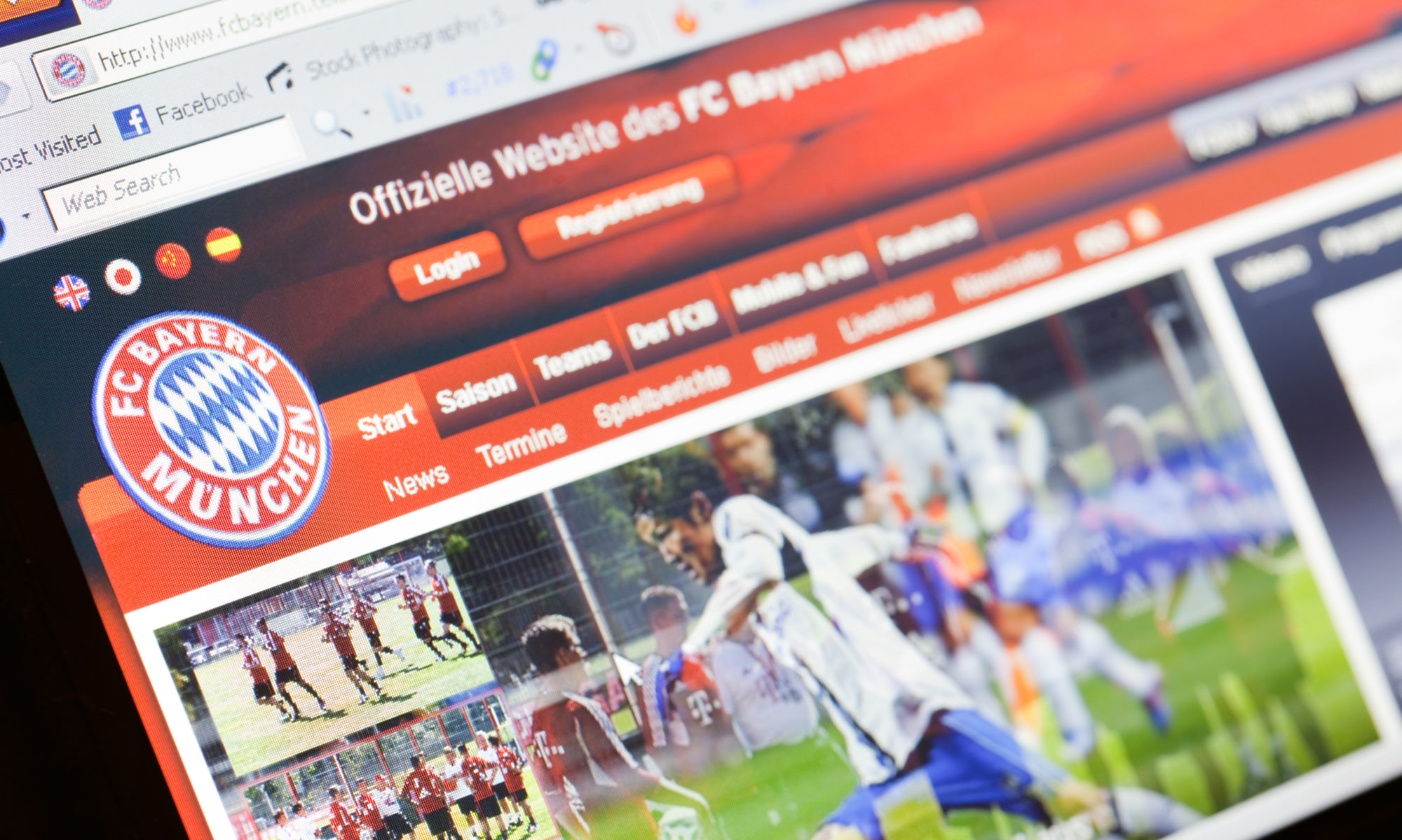
Homepage of Bayern Munich, the largest soccer club in Germany using Go Sitebuilder for sport fans.

If you are a serious sports fanatic then you might find it slightly frustrating trying to tell friends and family about the latest sporting updates. The more excited and in-depth of an explanation you go into, the more their eyes glaze over and the more disinterested they seem.

That’s why being a part of a sports fan website can be a great thing for a sport-lover: you are able to share your interests with countless numbers of like-minded people, safe in the knowledge that they will listen to your every word. Having a sports fan site creates a real sense of community within your sports area of choice, and it allows you to engage with your hobby as much or as little as you desire. In order to grow this sense of community, it is important that you include a few important functions within your site so that it can prosper. 

Social media 

If you use social media regularly then you will understand the importance of its use in the sporting world. By being able to link your social media to your sports fan website, other users will be able to see what kind of sport-related information that you’re posting. This doesn’t need to be a time-consuming essay: Twitter only lets you write 280 characters at a time, meaning all sport updates have to be kept short and sweet. 

Linking your social media to your website also shows other fans that you know what you’re talking about. For example, if you’re posting live updates of results and commentary on the latest footie game then it’s clear you’re a true fan, and are committed to ensuring that your website is useful for other sports fans.

Having live updates which are shared both on your website and your social media is also a great way to reach out to professionals on the go who might not have the time to always keep up to date with their favourite game. By keeping them in the loop, you’re more likely to build a strong sports community that includes everyone.

If you want a live chat room then linking your Facebook messenger is a great way to keep everyone connected so that you can share your love for sport with others at any time of day.

Blogs 

If you want to commit a bit more time to your fan site, then blogs are a great way to draw others to your website. By writing opinion pieces about certain matches, providing history on a certain popular player, or even offering information pieces about the importance of your sport of choice, you are bound to get more people interested in your content, thus inspiring them to become a member of your fan site. 

Writing blogs can also increase the visibility of your fan site. If people are googling questions online, and Google’s search engine picks up on the key terms from the question within your website, it is more likely to boost your website further up the search index. This is something called SEO – search engine optimisation. This is important if you want to increase your membership number: the more people who find your fan site, the more likely it is that you will generate larger numbers of interest. 

Upload photos 

Uploading photos is a great way to add some visuals to your website: whether you’re posting pictures to show support for your favourite player or want to post your own snaps from a live game, it’s a good idea to have a photo gallery to display all of this. It adds a personal touch, and allows you to share your opinions about a game/players in an authentic way.

If you want to get other site users involved then you could encourage them to send you photos of their own about the chosen sport – why not encourage them to send you their pictures through social media, and then you can upload them onto your fan site? This would encourage others to become actively involved with your fan site, ensuring that you have a steady stream of people who want to become a part of your community. 

How to set up a fan site 

Whilst setting up a website might be daunting, don’t let this stop you from building a thriving online sports community. Go Sitebuilder does all the hard stuff for you, meaning that you can start your fan site free from any hassle. Not sure if you’re ready to commit yet? Their 14-day free trial gives you all the time you need to decide whether or not you want to start your sports fan site today!

How do you get more customers into your beauty salon

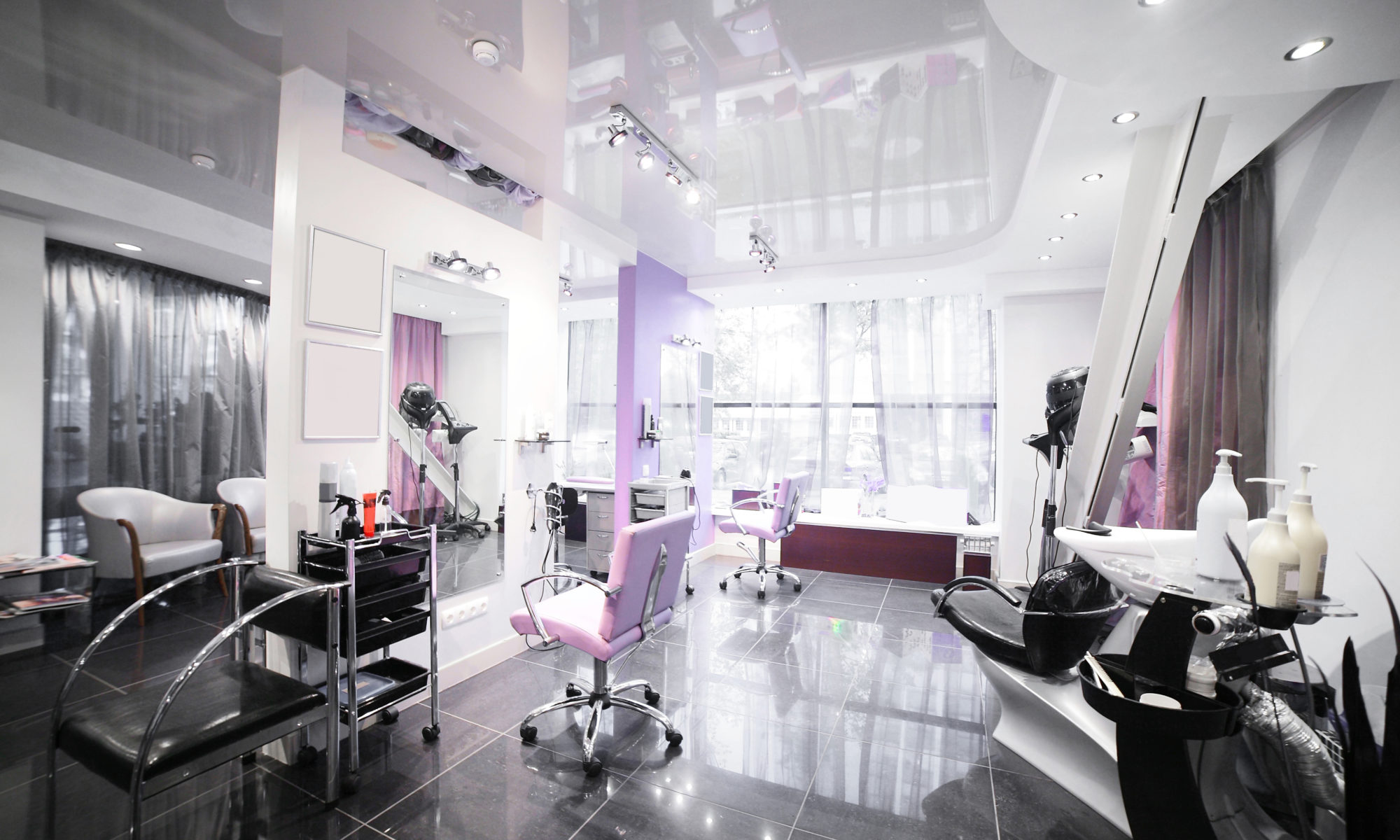
brand new interior of european beauty salon to get more customers using Go Sitebuilder

Attracting more customers to your beauty salon is vital to grow your business. New visitors can become loyal returning customers, and with the right marketing strategies, they can share their experiences of your business with friends and family. The nature of beauty salons is that word of mouth is one of the most important ways to spread the word surrounding your business. However, in order to do this you need to start by attracting more new customers. 

There are many ways you can attract new customers to your beauty salon. This article shows a few marketing strategies you could use to attract new clients and grow your customer base.

Effective Website Design 

A well designed website can significantly increase the number of customers that visit your salon. Visitors to your website will form a judgement on your website as soon as they see the first page, and according to Stanford Web Credibility research, 75% of people judge a business’s credibility by the design of its website. This means that when using a website builder, you need to make sure that your website looks professional and communicates your beauty salon’s atmosphere and ethos. 

In order to create an effective website there are a number of aspects you should consider. Often businesses such as beauty salons will consider matching certain aspects of their website to their beauty salon. For example they may have the same colour scheme on the walls of their salon as they have on their website. 

Key points to consider are:

  • Colour scheme 
  • Font 
  • Layout 
  • Logo
  • Photographs of your work 

Contact Options

The most savvy salons will have various contact options on their website to make booking a service as hassle free as possible. In order for potential customers to gain an insight into your business, you should consider showing your range of services. Also consider showing staff members’ specialities and the price of each service.

A great tool for your website is a contact form which can take personal details such as an email and full name. Having this information also allows you to contact the client after they visit your salon with offers or to remind them of the appointment. 

Your website should also provide details of how to contact your salon if the booking system does not work, or if there are more questions that the visitor has. You should include:

  • Phone number 
  • Email
  • Address

These should be displayed clearly at the bottom of your webpage. 

Clear Information

Another important facet of any website is providing important information to visitors that is easily accessible and simple to understand. This can be provided through sections on your website. Headings such as the titles listed below can be a good place to start to ensure you include all important information:

  • About Us 
  • Meet The Team
  • Price List 
  • Our Services
  • Find Us 
  • Contact Us
  • Frequently Asked Questions  

Having all relevant information on your website allows visitors to get a clear idea of your business.

Relevant Social Media 

Another important feature for any beauty salon is to have a presence on a range of social media platforms. Social media can increase the exposure of your beauty salon to new customers. Social media can also be a great way to showcase your work in a more informal manner. Instagram is one of the most-used forms of social media for beauty services, so photographs on this platform will help people discover your services and entice people to visit your salon. 

The most important aspect to remember when creating a social media presence is to post regularly and ensure your photographs are high quality and well lit. If you are not sure what kind of images would work well on social media then search for different beauty salons or beauty brands and you will get a feel for what makes a successful platform. 

Social media can also be a good way to communicate offers your salon may have. For example, you may offer a 10% student discount and through the use of social media you can advertise that to a wide range of people. 

This can be especially effective for short term offers, for example on Mother’s Day you may offer 20% off for mothers and daughters if they come in together. This discount can be sold through social media and requires a set of steps such as signing up to a mailing list or following your Instagram account. By setting out your offers in this way, you gain a new way to communicate in the long term with potential clients.

Brand Design 

In a market such as beauty the appearance of your business is extremely important in garnering new customers. Having a strong logo and design of your salon is vital in gaining new customers and getting them to come back again. Don’t feel you have time? There are loads of great free online tools to help you design a colour palette, like Colormind, or to design a quick and easy logo, like Looka.

If your salon has not had a redesign recently and you are seeing declining interest it may be time to revamp your brand. This can be as simple as redesigning your website to make it more user friendly or changing the colours you use in your salon. A professional website and design gives customers a sense of the professionalism of your business and allows them to connect to your services easier. Publicising your new look on your website and social media is another way to heighten interest in your salon.

If you don’t have a website yet, or you are looking to rebrand but can’t quite find the time, then Go Sitebuilder is a great option. Designed for simplicity and speed helps you get back to what you’re good at, our website builder means you can have a beautiful and professional-looking website up in minutes! There are even ready-made templates perfect for a beauty salon to save you time and hassle. Try our 14-day free trial today. 

How to Create a Successful Events Website

Casual Catering Discussion Meeting Colleagues at an event

Are you looking at creating a website for your event? Keen to spread the word on a new exciting occasion? There are some easy steps you can take to raise awareness of your event and create a successful events website. 

Why Create an Events Website?

An events website can increase knowledge of your events and ultimately encourage more people to come to them. A website can communicate key information surrounding your event such as dates and location. Without a website, you are relying on word of mouth or press releases which may not reach as many people as a website can. 

A well-designed website can also portray key aspects of your events such as the event ethos or attract a certain target market depending on how you design and present your event. This is key in ensuring that people who would benefit the most from your event are finding your website easily and are easily directed to all the information they need to attend. 

What are the Key Features of an Events Website?

For every website there are some key features to consider. However, for an events website aspects such as dates, times, location and other details are the most important to communicate clearly with visitors to your website. Some key features to think through when designing your website are:

Important Information: For an events website it is vital you present the important information surrounding your event clearly on your website. This ensures that visitors know immediately about your event and whether or not they can attend. You must include information such as:

Date and Time of the event – Without the date and time visitors cannot know whether they can attend. The date and time should be clearly advertised on the first page or as a header to your website.  

Location and Transport – Perhaps include a Google Map link as well as an address. If the location is difficult to find consider including instructions on how to reach you. Try to include this for multiple types of transport, for example have the nearest train route as well as car directions.

Price – Ensure that you clearly show the price. If this is a multi-day event ensure that you have prices for each day if that is an option. Make sure to include how to purchase the tickets, whether this is on the door or over an online ticket site.  

Type of Event – Is this a music festival or a fundraiser? Or both? Try and present what kind of people will be at this event as well. For example is this a family friendly event, or something for young people? 

Accommodation – If your event spans over multiple days it may be wise to include information regarding accommodation. This may be camping or similar, or advice on where to find accommodation in the city. 

Eye-catching Design: In order for your website to attract as many people as possible, it is crucial to have an engaging website design. Using a good website builder will mean you will be able to easily add features which communicate aspects of your event without having to include paragraphs of content. 

Key aspects of good website design for an events website include: 

Colour and font – Two of the most important aspects of website design is picking a colour and font to use. Different colours portray different emotions or atmospheres. For example a family friendly music festival like Latitude may have bright colours, whereas a heavy metal festival like Download may opt for a darker colour scheme. 

Fonts can also have an impact on the type of event. Often events have a specific font they will use for their logo and throughout their website to create a brand image that is easily recognisable wherever it is used. 

Posters – Events will often have a poster designed which can be displayed on their website, social media platforms and put up around the location. This poster should be eye catching and include all relevant information (including a line up/schedule if this is relevant)

Layout – An effective events website will have a clear layout which is easy to navigate. This should include an ‘about’ page, information and ticket buying facilities (if relevant). Another key aspect many events pages include is a frequently asked questions (FAQs) page, which allows them to provide more information on specific questions regarding accessibility or food suppliers for example. 

A successful events website will consider all of the aspects above in order to attract as many people as possible and create an event which will be talked about for many years to come!

If you are looking to build a website or blog for your company, then look no further than Go Sitebuilder! Our simple design means you can have a professional looking website up and running in minutes, with easily shareable content and information to encourage as many people as possible to attend your events. Try our 14-day free trial today!

What are some of the latest web design trends?

top view of a computer, laptop, smartphone and tablet on a desktop workspace. responsive website on screen. 3d rendering. All screen graphics are made up using the latest web trends

You’ve come to make your website and you want it to stand out and look professional, modern and stylish, but you know you don’t have the time to design a website from scratch. Don’t worry, we’ve got you covered with a list of some of 2020’s latest web design trends that are easy to implement in your website builder.

Vibrant colours

Don’t be a shrinking violet! Using big, bold colours will help your website stand out, but make sure not to use too many at the same time – neon yellows, pinks and greens all together will be a real shock to the senses! Instead, choose one or two vibrant colours – preferably one that is in your logo or part of your brand identity, and then use a muted colour of text to complement it, like Cyclemon have done on their website. If you’re not sure what colours to go for, try a colour palette generator like Coolors to give you inspiration.

This adds visual interest, and makes it more likely that people are going to remember your brand. The most important thing to remember, though, is that this is really dependent on your company and what you’re trying to promote – a lawyer’s website might want darker and more professional-looking colours, whereas an events site that organises festivals can go wild with a rainbow of hues. Make sure you are accurately representing your brand to avoid a sense of disconnect between your site and the services you provide.

screenshot of Cyclemon homepage

Cyclemon use a bright yellow background with a complementing red for their brand title, but the rest of the text is in muted colours.

Gradients and duotones

Still thinking about colours, now we’re talking gradients! For those who spent hours deliberating on which colour gradients to use in their powerpoint presentations in IT class at school, it has a retro feel. Now though, these gradients are getting a modern twist with futuristic colour themes, like blues, purples and hot pinks. 

Play around with radial (circular) or linear gradients, or have more than one colour like Spotify. This is a simple and effective look, as you don’t need super high-quality images; the colour does the work for you.

Screenshot of spotify homepage

Spotify’s homepage uses a radial gradient from left to right that fades to black at the bottom. 

Enhanced images and filters

Images are extremely important when it comes to websites. They have to be good quality, well composed and represent your brand, but for 2020 you can go a little further. 

To make your images stand out, you have different options. If you’ve already got a vibrant colour background, why not make your photo monochrome to make it stand out? Another trend is images that are in a shape, like a circle or a triangle, that you can layer with other elements on your page. 

The simplest way to get your image to stand out is to add a filter. You can overlay the image with a colour – the colour of your brand, perhaps – or just a colour that represents what you do most.

We love this Go Sitebuilder website example, where Polly Evans Hypnotherapy have put a muted filter on a vibrant image to emphasise the sense of calm their hypnotherapy will bring to clients. 

screenshot of a hypnotherapy website

Polly Evans Hypnotherapy does a great job of adding a filter to an image to represent her brand.

Dark mode

It’s not as scary as it seems! Dark mode, simply put, is having a dark background with light text, as opposed to the standard mode on your phone or laptop that usually has a light background with dark text. Dark theme on screens reduces eye strain and extends a screen lifespan, and as more devices are giving users the option to enable the dark theme, people are getting used to it. 

The good news is that using a dark mode colour theme will help your design elements stand out more by making them contrast more. Black and white is an obvious choice, as displayed beautifully here by design studio Wonderland, but feel free to play around with it – what about a navy blue background with pale cream text?

Screenshot of wonderland design studio homepage

By having contrasting white text against a dark background, Wonderland’s message really stands out. 

Extended white space

Another trend that is really gaining traction this year is the use of space. It’s easy to think that an area of white space looks unfinished, or messy, but in fact it adds to a minimalist charm that is growing in popularity. 

Rather than using five photos, really think about what you want to show your users and try and limit it to just one or two on the homepage. This shows that you’re not trying too hard and that you’re confident that these pictures show the quality and style of your work. It will also prevent the user becoming overwhelmed when they arrive on your site. You can do this with our website builder; have a look at MND Tee that does a great job with managing white space. 

Screenshot of MND Tee website]

The white space on each side of the images draws the eye to the centre of the site. 

We hope this has helped you with some ideas on how to make your website look on trend for 2020! With Go Sitebuilder, we have ready-made themes to help you choose which one represents your brand best, colour palettes to help you create a stylish look, and an in-site image editor so you can really make your images pop!

Try our 14-day free trial today to see how our website builder can make your website building experience quick, simple and – most importantly – on trend.

How financial advisor websites turn visitors into clients

Financial advisor meeting with a customer in his office, he is explaining a contract document and policy to the woman sitting at his desk

The most successful financial advisor websites have effective methods of turning visitors into clients for their business. In an increasingly online world, having an effective website which showcases your services is key to engage clients and encourage them to contact you for your services.

In this article we will take you through some of the most important aspects to think through when trying to gain clients through your website. 

Building Trust in Client Relationships

One of the most important aspects in any business is to build successful, trusting relationships with clients. This leads to long term business partnerships that result in high satisfaction on both ends.

One way to do this through your website is to include credentials. By including credentials in your website the visitor is more likely to view your business as professional and trustworthy. 

Some types of credentials you could include are: 

  • Honours or awards gained by the company or personnel
  • Mentions of your firm or company members in the press 
  • Links to articles in major publications authored by your employees 
  • An infographic or statistics showing your company’s growth

These different types of credentials showcase your ability to work in a professional manner, showcasing the positive strengths of your business. 

Having Multiple Contact Options 

Another important feature of your website should be the contact options for visitors. Having a professional website will be wasted if there is no way for a visitor to contact you should they wish to. 

Making your contact options clear will lead to more customers to contact you. Most websites place these at the bottom of every webpage, so as to make them as easy to find as possible. 

Some examples of contact options are:

  • Email
  • Phone number 
  • Address 
  • Message Boxes – these often correspond to an email, but allow visitors to directly message from your website. 

Showing your Services 

With any business it is important to showcase the services you are providing, this is especially important for financial advisors. Clearly showing the type of financial advice you are offering will help gain clients and give them a better understanding of your business. 

This can be done through a range of methods. Creating content is one effective way; by showing case studies or videos clients can see the success stories of your work. Testimonials are extremely important; according to Vendasta, 92% of people look at reviews when considering a purchase. Alternatively, detailed descriptions of each service can be effective in communicating your services. 

Marketing Strategies

Different forms of marketing can help bring more visitors to your website. Certain strategies such as using Search Engine Optimisation (SEO) can increase the number of times customers come into contact with your business. The more visitors become familiar with your company the more likely they are to become a client. 

Another way to market your business can be through advertisements on sites such as Facebook and Google. This increases the number of people you are reaching and therefore can increase your client base.

An Easy to Navigate Website

Having an intuitive website encourages people to spend time engaging in your content. By laying out your website in a simple format visitors can clearly answer questions they have surrounding your business. 

When trying to turn visitors into clients it is important that visitors can find information easily. When using your website builder, you can choose to lay out your website in a number of ways, but the most important guidelines to follow are to make sure you are answering the core questions that your visitors will have when they arrive on your website:

  • Who are you?
  • What do you do?
  • Why should I choose you?
  • Where can I contact you?

These simple headings are just a starter, but already the visitor would have an understanding of your business. Make sure your navigation is simple and clear, and that in one or two clicks, a user can find the answers to all the questions above. 

Create Incentive

In such a competitive market having a feature which entices customers is important. One way to encourage visitors to become clients is to offer an incentive. This could come in the form of an offer or discount on your services. When framed correctly, an offer can bring in many new clients and not have negative impacts on your costs. These discounts can bring in new customers who may become long term clients. 

If you are looking for a website builder for your company, then look no further than Go Sitebuilder! Our simple design means you can have a professional looking website up and running in minutes, helping you turn visitors into clients. Try our 14-day free trial today.