Checklist: Starting your own website as a small business

Small business owner building a Go Sitebuilder website

Are you a small business looking to launch your first website? There are quite a few things to remember when creating one, so we’ve put together a helpful checklist so you don’t forget anything!

1. Choose a domain name

One of the most important things for you to consider when setting up your website is a domain name – the digital address that people will use to connect to your website. If possible, you want it to be an exact match of your company name but one that isn’t too long. People like to access short domain names, so if you have a long company name, opt for an abbreviation. However, make sure it’s recognisable – as a small business you will want to ensure your dedicated customer base is able to find you on the internet.

To help with getting you set up with your website when you purchase a website subscription with GoSiteBuilder, we’ll provide you with a free domain name.

2. Choose your business email addresses

For businesses, choosing a domain name and email addresses often go hand-in-hand. Business email addresses can range from sales emails to customer service emails. It is important to think about using multiple email addresses so relevant customer queries are sorted from the start and find their way to the right person in your business. This will save you business time and make everyone’s life easier. If a business email is something you don’t have yet, with our subscriptions, you can choose up to five custom email addresses.

3. Create your website header

It’s likely you will want to start constructing your site by creating a website header. This usually consists of a few elements. Add your company logo – most brands opt to have it in the top left of every page on their website. Make sure it’s clickable too, site users like to be able to click on logos to link them back to the homepage. Along with your logo, you’ll want to make sure you’re incorporating a main navigation. This usually includes links that will take you to specific pages, such as ‘shop now’, ‘contact us’ and more. The header is also a great way to introduce your brand. Including taglines, imagery and brand colours will really make it pop. And, most importantly, don’t forget to include a clear and concise call to action (CTA).

4. Build more content with pages

As a small business, you are going to need to start building a range of content to build trust with your potential new customers and ensure you climb search engine result rankings.

Here are some pages you should consider adding to your new website:

  • About us page – Tell people your vision, your mission, and why they should engage with your brand.
  • Contact us page – Create an easy way for your customers to reach you. Add your email address and a contact form. If you have brick and mortar location, you can highlight this by adding a map which can include your exact location and opening hours, too!
  • Testimonials/reviews – People trust the opinions of other people, not brands. Therefore, displaying reviews from real people is a great way of showing users that you are a trusted brand.
  • Blogs – About anything that is relevant to your brand. If you can become a trusted voice in that industry, then people will continue to come back to you for more technical reading.

For more information on what pages you need on your website, head over to our blog and make sure your business is covered.

If you’re still unsure where to start with your website, drop us some questions at marketing@gositebuilder.com or simply get started with a free trial and use the live chat option to talk to our friendly customer success team.

How to make a physiotherapy website

How to make a physiotherapy website

As a physiotherapist, your website should not only showcase your services, but it should exude reassurance and professionalism. Here are some aspects to think about when creating your website to evoke the right kind of image.

Colour choices

We associate colours with certain images, feelings or characteristics, so use this to your advantage on your physiotherapy website. Warm, soothing tones such as green and blue are especially ideal for use on a physiotherapy website, while a bold colour such as red is also a good choice to invoke a sense of energy and wellbeing. Think about how you use the different colours in the text, layout and your images to create the right kind of vibe.

Professional fonts

The font that you choose for your text will also speak volumes, so pick one that has a professional feel to it. For instance, many medical-related websites make use of a sans serif type of font, as this looks clean and professional. It’s also easy to read, making it ideal if you need to include a lot of text to explain your physiotherapy services.

Simple design

Keep the design elements of your site simple, so that it emits a clinical feel and is easy to navigate. Including an image of yourself creates a personal touch, while additional photos relating to your services can help to set the tone. This could be as simple as uploading a decent stock photo of a therapist’s hands massaging a client’s back. It’s also important to have an obvious way for people to get in touch, so make sure you have a telephone number or contact form in a clear location on your website.

Content

Think about who your target audience is and adapt your content accordingly. Don’t assume that everyone automatically knows what physiotherapy services are and how they can benefit from them, so keep jargon or complicated terminology to a minimum. If you’re unsure, you’re not alone, creating buyer personas will avoid any confusion! You might have heard of them before, perhaps you know what they are, or maybe you’re scratching your head. Whatever your knowledge, don’t worry – we’ve broken it down within our free beginners guide eBook. Provide a brief introduction to the services you offer and how they work. You might wish to feature an FAQ section for popular questions that clients may have. A testimonial page with reviews from previous satisfied clients can also help to sell your services and provide reassurance.

Your story

Anyone seeking the services of a physiotherapist will want to ensure they’re in safe and capable hands, so detail relevant information about yourself, including your professional qualifications and industry accreditations. Include a phone number, email address or contact form on your site so clients can easily get in touch to make an appointment or find out more about your services.

Local SEO

Your target audience is likely to be based locally, so include information on your website that helps to get you ranked higher in local searches. Incorporate keywords into your text that include the name of your location, such as ‘if you’re looking for physiotherapy services in x location‘, or ‘our x-location physiotherapists’, to boost your local search ranking. In your contacts section, add a Google map so that clients can easily see where you are based.

If you’re new to SEO, check out our beginners guide to SEO – it’s not as difficult as you might think!

We hope this article helps any physiotherapists looking to get their business online or any physiotherapy businesses who are looking for tips to update their existing website. If you’re still looking for the right website builder, check out Go Sitebuilder where you can sign up for a free trial and see just how easy it is to get your physiotherapy website online.

Why you must have a menu on your restaurant website

Building a Restaurant Website using Go Sitebuilder

Many people consult a restaurant website first before deciding to book a table. It encourages people to book a table at your restaurant over others and attracts people to your website and establishment. For this reason, getting your site spot-on is crucial to winning potential customers over to visit your eatery. While there are plenty of elements that go a long way to ensure your restaurant website hits the right mark, including menus on your site is especially important.

Showcase what you’ve got to offer

Including menus on your website, whether as downloadable pages or within their own sections showcases what your restaurant has to offer. Your menus are your number one selling point, so without them, new customers won’t know what to expect. Many people also choose a restaurant based on price, so having your menus easily visible lets would-be customers know if the food you offer is within their intended price range. Your menus will also give a clue as to the kind of ambience or experience diners might expect, from casual meals to more formal, a la carte dining. This might be reflected in the type of food being served as well as the offers available. It’s also worthwhile including a gallery section on your site with images of some of the dishes off your menu, to whet customers’ appetites.

Catering for every taste

Lots of people have special dietary requirements, so providing your menus online lets people see what you offer to cater to different needs and tastes. It’s a good idea to include any relevant symbols next to dishes to denote any dietary options, such as gluten-free or vegetarian. If you cater to youngsters, don’t forget to include a children’s menu.

Easy to view

Since restaurant menus play such a big role in customer decision-making, when including yours on your site, ensure that they’re easy to find and access. If you add downloadable PDF menus, they should be fast to open, as well as properly configured for easy viewing on mobile devices.

Keep menus current

Having menus included on your site makes for a worthwhile opportunity to keep customers updated on any offers you have on or any new dishes. Keep your menus current, so that customers who visit your premises know what to expect. You’re unlikely to get the thumbs up from diners if you increase your prices or drastically change your dishes without reflecting these alterations on your advertised website menus. It’s also not good business to still be promoting your Christmas menu online when it’s almost Easter. Bear in mind that search engines rank sites higher that keep their content fresh and up to date.

If you’re looking for a new website for your restaurant check out Go Sitebuilder today! Get started for free and join over 9 million people already growing their business with Go Sitebuilder.


How to make your bar or restaurant visible on Google

If you own a bar or a restaurant, chances are that you operate in a highly competitive market. Getting your bar or restaurant visible on Google is one way to stand out from the crowd – and here’s how to do it.

Get on Google

If you want to be seen by Google, the first step you need to take is to get on Google itself. Register with Google My Business to increase your presence on the site, so that your name appears in local listings and on Google Maps.

Devise a local search strategy

Unless you operate a global chain of bars or restaurants, most establishments will have a localised presence, so use this to your advantage to enable your Google ratings to soar. Adding your name to local search listings will work in your favour with Google, but including relevant geographical keywords naturally within your website’s content can also help to boost your visibility online.

Mobile friendly

Any bar or restaurant that wants to earn brownie points with Google needs to have its website configured so that it is easily viewable on mobile devices. This also makes for a better user-experience, bearing in mind that the vast majority of online searches are now conducted using mobiles.

Focus on content

You’ll boost your visibility on Google if you focus on adding varied, quality content to your website that is useful to viewers. Menus are a worthy inclusion on a bar or restaurant website, but images of your food or premises also score top marks with search engines. If you do include photos, however, make sure that the image files aren’t so large that they’ll slow down the speed of your site. This could work against your Google ranking.

It’s also a good idea to keep your website up to date if you want to see it soar on Google. Add content on a regular basis, and consider starting a blog. Include relevant keywords within your content that will get your name visible on Google – but don’t necessarily opt for the most obvious ones. Choose keywords that are unique to your brand to boost your rating.

Add links

Another way to increase your visibility on Google is to feature your web link on other relevant websites. There are lots of options for this in the bar and restaurant industry, such as through an esteemed food blogger’s site, or an online magazine detailing local eating and drinking establishments.

Social media

Google favours those websites that have a presence on social media sites, so as well as owning a website, create pages on relevant platforms that showcase your bar or restaurant brand. Include buttons on your site that link to your social media pages to further boost awareness and appeal of your business.

We’ve created Go Sitebuilder to be the easiest website builder for small businesses. If you’re looking to give your business the web presence it deserves, check out Go Sitebuilder’s 14-day free trial and see just how easy it is.

A guide to website sections

Website building entrepreneur

With sections, it’s easier than ever to create your own website. But what is a section? And what are all the different sections for? In short, a section is a pre-made building block, and you can use them in any combination to create your website. They’re all customisable, so you still have the freedom to make your website your own, but we’ve done some of the legwork for you! To make things even simpler, we’ve created a guide to the different types of sections we offer:

Hero

Hero section

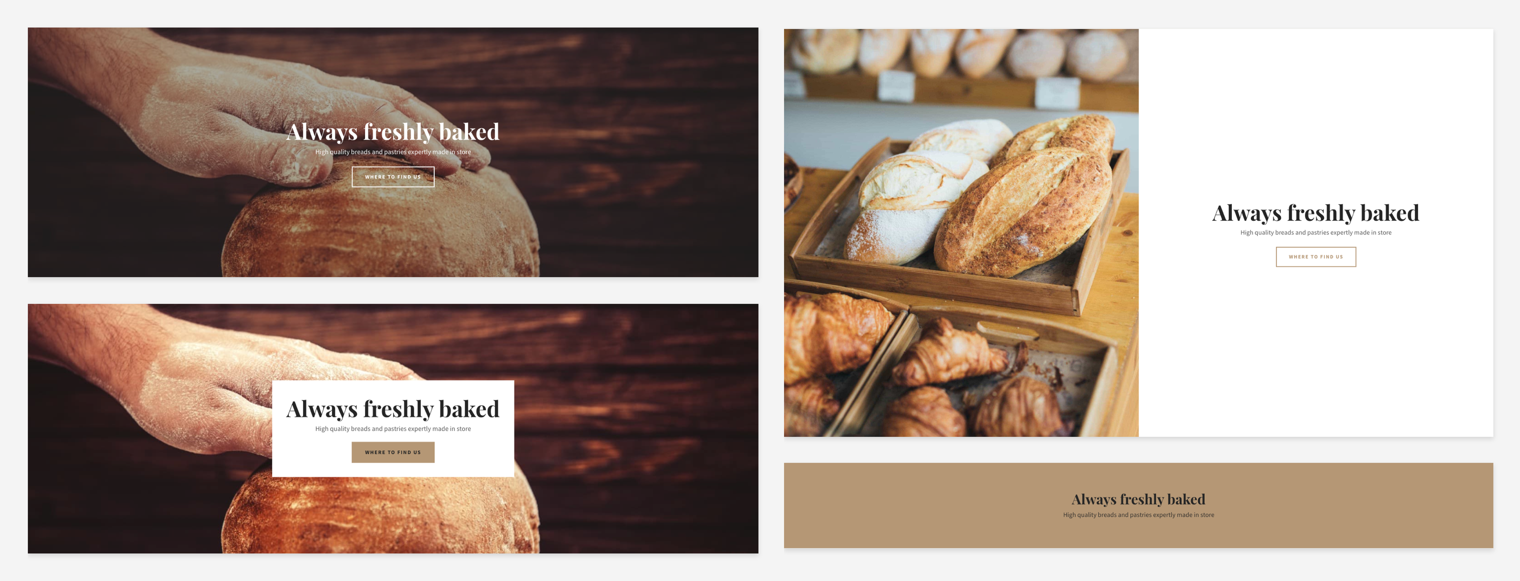
The hero section is just as important as it sounds! It’s generally the biggest, most impactful thing people will see when they first enter your website, so it should contain key information, such as your company name, a short strapline and the most relevant call-to-action buttons, such as ‘Shop now’ or ‘Contact’.

Image and text

Image and text

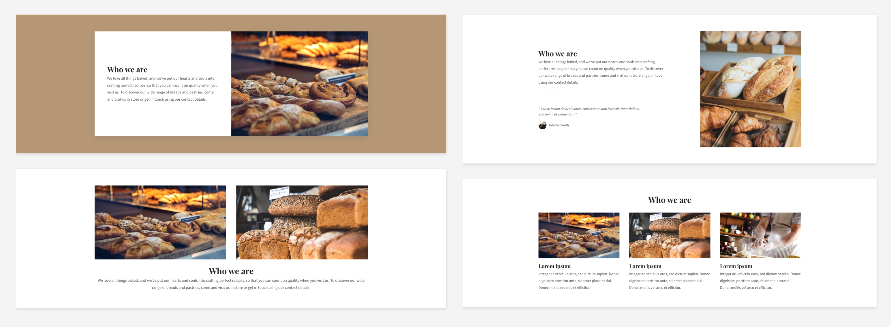
This one does what it says on the tin – it allows you to add an image/text combination. This is great for when you want to show an image of what you’re writing about, or just for keeping a page visually engaging. If it’s the latter you’re aiming for and you don’t have a specific image in mind, this is a great place to make use of our stock image library.

Text

Text

This category covers many types of text, from paragraphs to headers and more, allowing you to really add personality to your website. Whenever you want to add some text by itself, this is the section you’ll need. You can customise it completely, from font to layout, and – most importantly – content! Take a look at guides like this for more advice on creating great content. 

Image

As with the text section, this is for when you want to add an image by itself. This could be a photo of your products on your homepage, a photo of you on the ‘About’ page or a (relevant) stock image to break things up. Studies show that images are a great way to keep things engaging, so image sections will allow you to do just that.

Gallery and slideshow

Gallery and slideshow

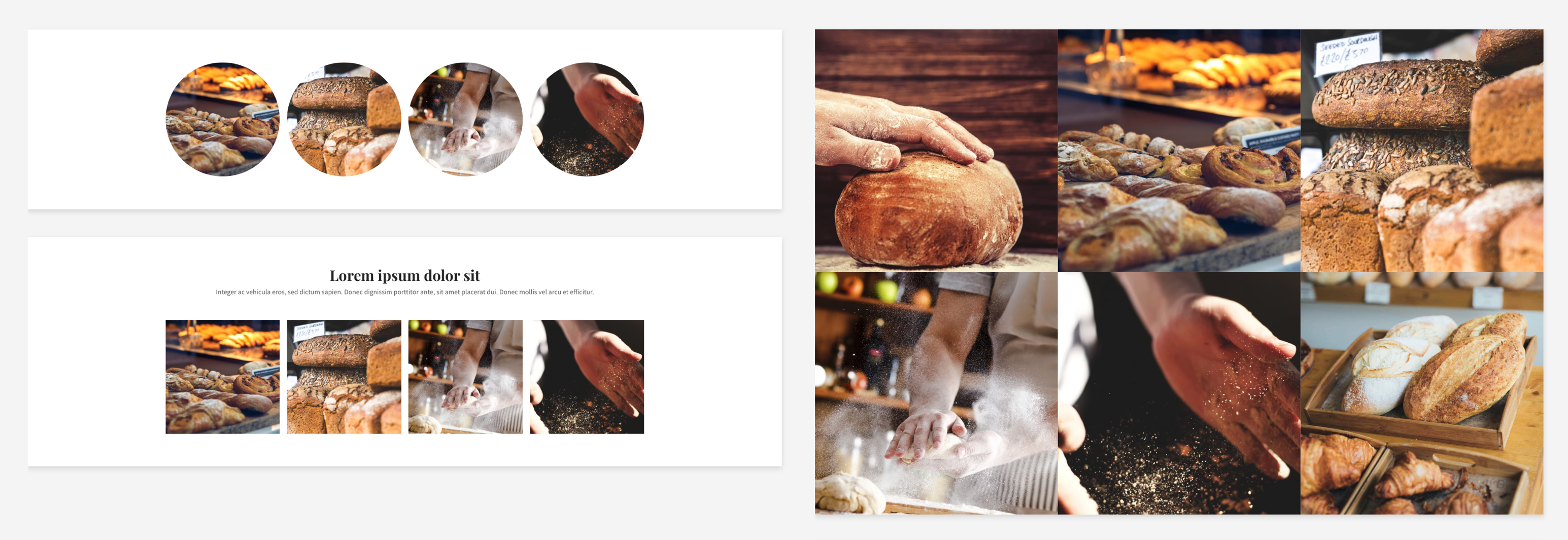
Especially good for showing off products or behind-the-scenes action, we have a range of different gallery and slideshow sections, so you can choose your favourite eye-catching display format.

Form

A great way to keep people updated and engaged is to create a mailing list. Putting a simple signup form on every page will allow them to add their email address in seconds. You can also add a larger form, allowing people to contact you with questions.

Contact

Contact map

You can provide as much or as little information as you like with a contact section. If you have a bricks-and-mortar location, the map feature will help people to find you, while email address, phone number and an additional contact form can all provide easy ways for people to get in touch.

Promotional

Highlight your store, products or special offers with promotional sections placed anywhere on your website. This is a great way to grab people’s attention while they’re browsing!

Social

Social media and a website are best when used together. Make sure people can find your social media easily with social sections. You can also use this to link to reviews on sites like Yelp.

Page title

As you might guess, this section lets you name each page. It almost always makes sense to have this at or near the top of your website. You can easily customise the fonts and colours here to go with the rest of your website and branding.

Video and audio

Video and audio

Using video on a landing page can increase conversion rates by a massive 80%. Easily include videos, with or without an introduction. If you have a YouTube channel, you can include your latest videos, or you can include a video of your products in action to show them off in your store.

Files

Anything people need to download from your website, from forms to instruction guides, can be included in this style of section. You can either put it right after the mention of a file or throughout the website to encourage people to access it.

Embed

If you have any code you want to include to add custom features or third-party services (like SoundCloud or booking forms) to your website, this is the section you can use. As with other sections, it can be placed wherever you want. The possibilities are endless!

Logos

Logos

Include logos anywhere on your website to show off partnerships, products you use or companies you’ve worked with. This is a great way to build trust!

Store

If you have an online store on your website, sales-boosting sections can make all the difference. Featured products and ‘basket’ sections are a great way to get people engaged and to turn visitors into customers! It’s often a good idea to place these at the top for easy access, but you can experiment with different placements and see what works best for you.

PayPal

Our PayPal sections make it really easy for your customers to purchase from your store. With different design options, you can make these sections fit in with your website’s overall look.

Blog

Feature your latest blog posts anywhere on your website to capture people’s attention while they browse, so they never miss an update.

So there you have it: a guide to all the sections you need to create your perfect website! We’re always listening to feedback and adding exciting new things to our website builder, so we’ll be sure to keep this guide updated as this happens. If you haven’t created your website yet, why not try a free trial? Happy sitebuilding!

What is SSL and why is it important?

You might have seen the term online or noticed your fellow small business owners talking about it at the last networking meeting, but what is SSL? Why is it important? and should you be worried if your website doesn’t have it? We’re here to answer these questions and explain how this techy term can help your business to succeed online.

What is SSL?

In technical terms:

Secure Sockets Layer (also known as SSL, SSL Cert or SSL Certificate) is a digital certificate. It authenticates a website and encrypts information passed through an online connection.

To you and me:

It provides a secure, private connection when browsing the internet! It keeps your website protected and provides a safe experience for your customers. 

SSL has become the foundation of internet security, keeping you and your customers safe from hackers as your valuable data travels through the world wide web. Every day we are reminded about the imminent online security threat and how important it is to protect our data. This doesn’t just mean financial data, but any data. We already know that we should purchase some kind of malware protection and create complex passwords, but we should also be ensuring that we’re buying from and browsing trusted websites. SSL provides that level of security and we should all be aware of its greatness! 

How do I check if a website is safe?

It’s easy to spot if a website is being actively protected by SSL. All you need to look out for is the https:// at the start of the website’s URL and a closed padlock icon next to it. It might look something like this:

A website and domain being actively protected by SSL

Chances are, your customers will be looking out for this too – so make sure your site is protected!

If a website isn’t protected, you might see something like this:

An example of an un-secure website and domain not being protected by SSL

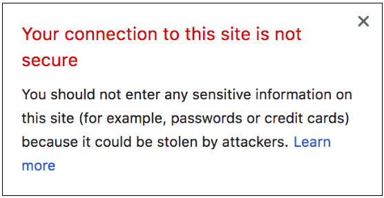
You might even be faced with one of these scary messages:

A browser security warning

This is all the more reason to make sure your website is protected. If you’re trying to sell products, the last thing you want is your customer’s browser warning them off!

Why is SSL so important?

Okay, so we’ve covered the main points of securing data and protection from online hackers. However, SSL provides more than just that, especially if you’re running a business. SSL can also:

  • Boost your Google rankings (who doesn’t want that?!): Google now considers SSL important for ALL websites, not just for those with checkouts or password-protected areas. With more activity online than ever before, Google and other major search engines are dedicated to countering security threats. As part of this, they’re using https as a ranking signal, encouraging people to be safe online and rewarding those who already are 
  • Provide credibility and build customer trust: Seeing ‘https’ or the closed padlock next to your website’s domain name instantly tells your website visitors that you are a legitimate business. This means that it’s safe to not only browse your website, but also to purchase from it.

What happens if I don’t have an SSL cert?

Your business probably won’t thrive online – and might not even survive. If you’re selling anything online or asking visitors to provide any data, such as credit card credentials or information via a contact form, you need to have an SSL cert in place. Even if you aren’t collecting this information, SSL will improve your SEO and your customers will know you care about their online security – it’s a win-win situation! If your customers don’t trust your website, you could miss out on valuable business. They might even be blocked from accessing your website completely if their browser deems it too unsafe to visit. 

While it’s always good to think about your website’s security, our advice would be to go one step further than this, and to invest in an SSL certificate today. There are lots of helpful guides out there to help you to choose the right SSL for you. If you’re using a website builder like ours, you might already have an SSL certificate included in your package; or perhaps your provider can supply one at an extra cost.

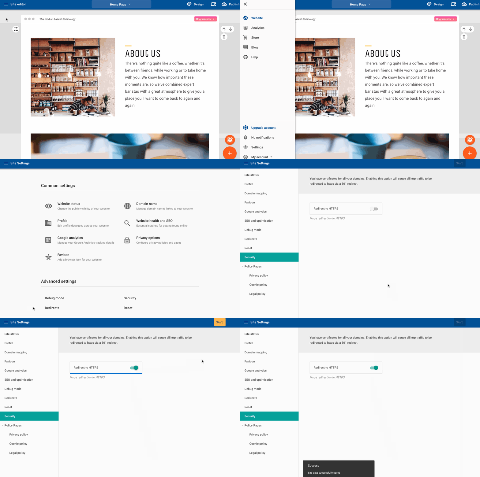
We know how important online security is for any business, so we’ve included SSL with every premium Go Sitebuilder package, completely free of charge; all you need to do is enable it! If you have a Go Sitebuilder website, here’s how:

If you don’t have a website or you’re looking to create a new responsive website that you can update from anywhere (plus a FREE SSL cert), sign up for a free trial with Go Sitebuilder.

What pages do I need on my website?

When you’re creating a website, it can be hard to know where to start – and when it’s okay to step back for a while. There are loads of different pages you can have, and it can be overwhelming trying to imagine how you’ll find time to create them all. However, we’ve got good news for you: you can create a professional, complete website with just six essential pages. These pages will cover all the bases, from showing your personality to sharing your products. If you choose to, you can add any additional pages later!

Homepage

This is where your customers will land when they first come to your website, so make sure you make it engaging and clear! Give your company’s name pride of place, and follow it with a subheading or strapline to ensure it’s clear to every visitor what you do. Remember that not everyone will be there because they looked you up specifically! Maximise your chances of converting new customers by showing them that you can give them what they need.

Use call-to-action (CTA) buttons to provide clear pointers to other key areas of your website. The best way to do this is via a menu and short sections leading to these areas (e.g. a short introduction to you, followed by a link to the full About page). This will give your customers an easy path to follow and keep them engaged. They’ve come to your website for a reason, so make it enticing for them to stay there!

About page

People like to know they’re doing business with a human being, and this page gives you a chance to show them that you’re just that! Show your customers who you are with an insight into your motivations and personality. You could do this by telling the story of why you started the business; introducing your canine- or feline-in-chief; telling people a little about your background… just be yourself!

For another human touch, don’t forget to add a photo! If you’re a little camera shy, you could always use a photo of your four-legged-friend or your workspace. Just ensure it’s something that will inject even more personality into the page, while keeping it visually engaging.

For more advice on creating an effective about page, we love these tips from Moz.

Contact

There are countless reasons why a visitor to your website may want to contact you. It could be a query about a product or service, a business enquiry, or a collaboration request… the list goes on, so make sure you give them a way to get in touch! The simplest way to do this is a contact form, but if you have a bricks-and-mortar location, then use a map feature to show them exactly where you are. You can also include an email address and phone number if applicable. If you do, make sure your email address is something professional and in keeping with your wider branding.

Store OR product information

If you have products or services to sell, an online store is the perfect way to do this. Even if you also have a physical location, selling online means that you don’t ever have to miss a sale. You can sell without even being awake! Make sure your products are all clearly listed, with all the relevant information. This will save your customers having to ask for clarification or return items, and it will save you from having to answer questions or process returns!

If you don’t have products or services which can be listed in this way, you should still have a products/services page: this is a great place to show off what you do! Give all the information you think potential customers will need to make a decision, and, for extra impact, include your contact details on this page too – giving them a way to take the next step once you’ve won them over!

Testimonials

Until your customers have seen how great your products or services are for themselves, the best way to breed their trust is to show them how satisfied other people have been. If you don’t have testimonials already, why not reach out to some of your satisfied customers to see if they’d be happy to provide one? If you’re going to do this, just make sure you’re complying with GDPR. Don’t contact customers or share their data without their consent!

It’s up to you how you structure this page, but a good rule of thumb for any copy-based page is to keep it visually engaging with product images and an easy-to-read layout. For extra impact, you could also place testimonials or quotes throughout your website!

Blog

Just like the about page, a blog is a great way to show your personality and create a loyal following. As well as this, it’s also a place to share exciting news, from product updates to promotions. If you need any more persuasion, businesses with blogs receive 55% more traffic than those without!

If you can, it’s good to get into the habit of sharing regular (e.g. monthly) updates. This will help you to get into a routine and open up the lines of communication with your customers. If you don’t always have big developments to share, that’s okay! You can also update on smaller or more personal developments, such as plans, house moves, goals and more. Your customers will appreciate the insight into the human behind the company. If you’re stuck for ideas, articles like this have some great advice.

Once you have these pages, you’ll find that your website has a complete, professional feel to it. When visitors come to your site, they won’t be left wanting at all. Just these few pages will give them all the information they need to really engage with your business.

If you don’t already have a website, you’ll need a simple way to create these essential pages. We’ve designed Go Sitebuilder to be a simple and effective way to get online, giving you everything you need to grow your business, wherever you are – no technical skills needed! Try it free today.