How to Create a Successful Events Website

Casual Catering Discussion Meeting Colleagues at an event

Are you looking at creating a website for your event? Keen to spread the word on a new exciting occasion? There are some easy steps you can take to raise awareness of your event and create a successful events website. 

Why Create an Events Website?

An events website can increase knowledge of your events and ultimately encourage more people to come to them. A website can communicate key information surrounding your event such as dates and location. Without a website, you are relying on word of mouth or press releases which may not reach as many people as a website can. 

A well-designed website can also portray key aspects of your events such as the event ethos or attract a certain target market depending on how you design and present your event. This is key in ensuring that people who would benefit the most from your event are finding your website easily and are easily directed to all the information they need to attend. 

What are the Key Features of an Events Website?

For every website there are some key features to consider. However, for an events website aspects such as dates, times, location and other details are the most important to communicate clearly with visitors to your website. Some key features to think through when designing your website are:

Important Information: For an events website it is vital you present the important information surrounding your event clearly on your website. This ensures that visitors know immediately about your event and whether or not they can attend. You must include information such as:

Date and Time of the event – Without the date and time visitors cannot know whether they can attend. The date and time should be clearly advertised on the first page or as a header to your website.  

Location and Transport – Perhaps include a Google Map link as well as an address. If the location is difficult to find consider including instructions on how to reach you. Try to include this for multiple types of transport, for example have the nearest train route as well as car directions.

Price – Ensure that you clearly show the price. If this is a multi-day event ensure that you have prices for each day if that is an option. Make sure to include how to purchase the tickets, whether this is on the door or over an online ticket site.  

Type of Event – Is this a music festival or a fundraiser? Or both? Try and present what kind of people will be at this event as well. For example is this a family friendly event, or something for young people? 

Accommodation – If your event spans over multiple days it may be wise to include information regarding accommodation. This may be camping or similar, or advice on where to find accommodation in the city. 

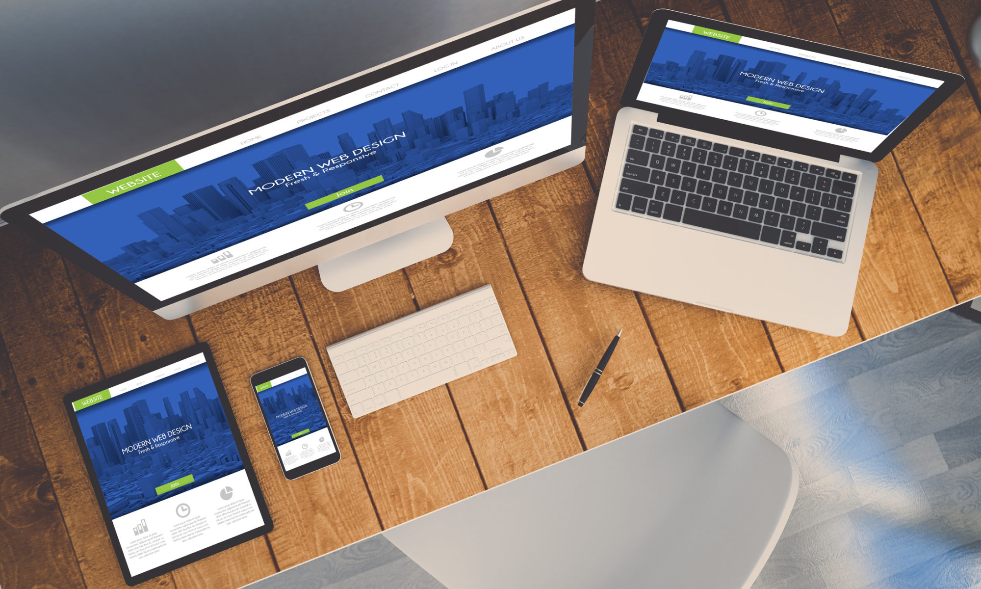
Eye-catching Design: In order for your website to attract as many people as possible, it is crucial to have an engaging website design. Using a good website builder will mean you will be able to easily add features which communicate aspects of your event without having to include paragraphs of content. 

Key aspects of good website design for an events website include: 

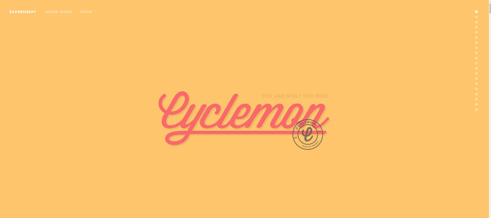
Colour and font – Two of the most important aspects of website design is picking a colour and font to use. Different colours portray different emotions or atmospheres. For example a family friendly music festival like Latitude may have bright colours, whereas a heavy metal festival like Download may opt for a darker colour scheme. 

Fonts can also have an impact on the type of event. Often events have a specific font they will use for their logo and throughout their website to create a brand image that is easily recognisable wherever it is used. 

Posters – Events will often have a poster designed which can be displayed on their website, social media platforms and put up around the location. This poster should be eye catching and include all relevant information (including a line up/schedule if this is relevant)

Layout – An effective events website will have a clear layout which is easy to navigate. This should include an ‘about’ page, information and ticket buying facilities (if relevant). Another key aspect many events pages include is a frequently asked questions (FAQs) page, which allows them to provide more information on specific questions regarding accessibility or food suppliers for example. 

A successful events website will consider all of the aspects above in order to attract as many people as possible and create an event which will be talked about for many years to come!

If you are looking to build a website or blog for your company, then look no further than Go Sitebuilder! Our simple design means you can have a professional looking website up and running in minutes, with easily shareable content and information to encourage as many people as possible to attend your events. Try our 14-day free trial today!

What are some of the latest web design trends?

top view of a computer, laptop, smartphone and tablet on a desktop workspace. responsive website on screen. 3d rendering. All screen graphics are made up using the latest web trends

You’ve come to make your website and you want it to stand out and look professional, modern and stylish, but you know you don’t have the time to design a website from scratch. Don’t worry, we’ve got you covered with a list of some of 2020’s latest web design trends that are easy to implement in your website builder.

Vibrant colours

Don’t be a shrinking violet! Using big, bold colours will help your website stand out, but make sure not to use too many at the same time – neon yellows, pinks and greens all together will be a real shock to the senses! Instead, choose one or two vibrant colours – preferably one that is in your logo or part of your brand identity, and then use a muted colour of text to complement it, like Cyclemon have done on their website. If you’re not sure what colours to go for, try a colour palette generator like Coolors to give you inspiration.

This adds visual interest, and makes it more likely that people are going to remember your brand. The most important thing to remember, though, is that this is really dependent on your company and what you’re trying to promote – a lawyer’s website might want darker and more professional-looking colours, whereas an events site that organises festivals can go wild with a rainbow of hues. Make sure you are accurately representing your brand to avoid a sense of disconnect between your site and the services you provide.

screenshot of Cyclemon homepage

Cyclemon use a bright yellow background with a complementing red for their brand title, but the rest of the text is in muted colours.

Gradients and duotones

Still thinking about colours, now we’re talking gradients! For those who spent hours deliberating on which colour gradients to use in their powerpoint presentations in IT class at school, it has a retro feel. Now though, these gradients are getting a modern twist with futuristic colour themes, like blues, purples and hot pinks. 

Play around with radial (circular) or linear gradients, or have more than one colour like Spotify. This is a simple and effective look, as you don’t need super high-quality images; the colour does the work for you.

Screenshot of spotify homepage

Spotify’s homepage uses a radial gradient from left to right that fades to black at the bottom. 

Enhanced images and filters

Images are extremely important when it comes to websites. They have to be good quality, well composed and represent your brand, but for 2020 you can go a little further. 

To make your images stand out, you have different options. If you’ve already got a vibrant colour background, why not make your photo monochrome to make it stand out? Another trend is images that are in a shape, like a circle or a triangle, that you can layer with other elements on your page. 

The simplest way to get your image to stand out is to add a filter. You can overlay the image with a colour – the colour of your brand, perhaps – or just a colour that represents what you do most.

We love this Go Sitebuilder website example, where Polly Evans Hypnotherapy have put a muted filter on a vibrant image to emphasise the sense of calm their hypnotherapy will bring to clients. 

screenshot of a hypnotherapy website

Polly Evans Hypnotherapy does a great job of adding a filter to an image to represent her brand.

Dark mode

It’s not as scary as it seems! Dark mode, simply put, is having a dark background with light text, as opposed to the standard mode on your phone or laptop that usually has a light background with dark text. Dark theme on screens reduces eye strain and extends a screen lifespan, and as more devices are giving users the option to enable the dark theme, people are getting used to it. 

The good news is that using a dark mode colour theme will help your design elements stand out more by making them contrast more. Black and white is an obvious choice, as displayed beautifully here by design studio Wonderland, but feel free to play around with it – what about a navy blue background with pale cream text?

Screenshot of wonderland design studio homepage

By having contrasting white text against a dark background, Wonderland’s message really stands out. 

Extended white space

Another trend that is really gaining traction this year is the use of space. It’s easy to think that an area of white space looks unfinished, or messy, but in fact it adds to a minimalist charm that is growing in popularity. 

Rather than using five photos, really think about what you want to show your users and try and limit it to just one or two on the homepage. This shows that you’re not trying too hard and that you’re confident that these pictures show the quality and style of your work. It will also prevent the user becoming overwhelmed when they arrive on your site. You can do this with our website builder; have a look at MND Tee that does a great job with managing white space. 

Screenshot of MND Tee website]

The white space on each side of the images draws the eye to the centre of the site. 

We hope this has helped you with some ideas on how to make your website look on trend for 2020! With Go Sitebuilder, we have ready-made themes to help you choose which one represents your brand best, colour palettes to help you create a stylish look, and an in-site image editor so you can really make your images pop!

Try our 14-day free trial today to see how our website builder can make your website building experience quick, simple and – most importantly – on trend.

How financial advisor websites turn visitors into clients

Financial advisor meeting with a customer in his office, he is explaining a contract document and policy to the woman sitting at his desk

The most successful financial advisor websites have effective methods of turning visitors into clients for their business. In an increasingly online world, having an effective website which showcases your services is key to engage clients and encourage them to contact you for your services.

In this article we will take you through some of the most important aspects to think through when trying to gain clients through your website. 

Building Trust in Client Relationships

One of the most important aspects in any business is to build successful, trusting relationships with clients. This leads to long term business partnerships that result in high satisfaction on both ends.

One way to do this through your website is to include credentials. By including credentials in your website the visitor is more likely to view your business as professional and trustworthy. 

Some types of credentials you could include are: 

  • Honours or awards gained by the company or personnel
  • Mentions of your firm or company members in the press 
  • Links to articles in major publications authored by your employees 
  • An infographic or statistics showing your company’s growth

These different types of credentials showcase your ability to work in a professional manner, showcasing the positive strengths of your business. 

Having Multiple Contact Options 

Another important feature of your website should be the contact options for visitors. Having a professional website will be wasted if there is no way for a visitor to contact you should they wish to. 

Making your contact options clear will lead to more customers to contact you. Most websites place these at the bottom of every webpage, so as to make them as easy to find as possible. 

Some examples of contact options are:

  • Email
  • Phone number 
  • Address 
  • Message Boxes – these often correspond to an email, but allow visitors to directly message from your website. 

Showing your Services 

With any business it is important to showcase the services you are providing, this is especially important for financial advisors. Clearly showing the type of financial advice you are offering will help gain clients and give them a better understanding of your business. 

This can be done through a range of methods. Creating content is one effective way; by showing case studies or videos clients can see the success stories of your work. Testimonials are extremely important; according to Vendasta, 92% of people look at reviews when considering a purchase. Alternatively, detailed descriptions of each service can be effective in communicating your services. 

Marketing Strategies

Different forms of marketing can help bring more visitors to your website. Certain strategies such as using Search Engine Optimisation (SEO) can increase the number of times customers come into contact with your business. The more visitors become familiar with your company the more likely they are to become a client. 

Another way to market your business can be through advertisements on sites such as Facebook and Google. This increases the number of people you are reaching and therefore can increase your client base.

An Easy to Navigate Website

Having an intuitive website encourages people to spend time engaging in your content. By laying out your website in a simple format visitors can clearly answer questions they have surrounding your business. 

When trying to turn visitors into clients it is important that visitors can find information easily. When using your website builder, you can choose to lay out your website in a number of ways, but the most important guidelines to follow are to make sure you are answering the core questions that your visitors will have when they arrive on your website:

  • Who are you?
  • What do you do?
  • Why should I choose you?
  • Where can I contact you?

These simple headings are just a starter, but already the visitor would have an understanding of your business. Make sure your navigation is simple and clear, and that in one or two clicks, a user can find the answers to all the questions above. 

Create Incentive

In such a competitive market having a feature which entices customers is important. One way to encourage visitors to become clients is to offer an incentive. This could come in the form of an offer or discount on your services. When framed correctly, an offer can bring in many new clients and not have negative impacts on your costs. These discounts can bring in new customers who may become long term clients. 

If you are looking for a website builder for your company, then look no further than Go Sitebuilder! Our simple design means you can have a professional looking website up and running in minutes, helping you turn visitors into clients. Try our 14-day free trial today.

How can I make my website look more professional?

Working woman on laptop trying to make her website look more professional with her son reading a storybook. Both sitting on a grey sofa in a living room.

Although you might think you have relatively good concentration, on the internet this is likely to be a lot shorter: the average attention span is around eight seconds. This means that you have a limited amount of time to make an impression on the site user: if your online business looks unprofessional and visually unaesthetic, then most people are likely to click off your website, without really looking at the content you offer. A professional web design ensures that the traffic flow to your website will want to remain, exploring what else you have to offer. With a strong web design, it is easy to make your online business appear all the more professional. 

Image is everything 

Having a visually appealing web design is paramount if you want to draw potential customers to your site. Although it is tempting to cram your website with anything that you feel would be of benefit to your users, in the website world, less is more. Google conducted a huge study, revealing that visitors are put off by visual complexity: by keeping your website design minimal, you can create a sleek, attractive appearance, which draws visitors to other parts of your website. 

This also shows to visitors that your business is professional: you have taken the time to ensure your web design is of a high quality, which tells the visitor that you’re not an amateur, and that you can be trusted. 

Using images is also a great way to add to your professional image. Uploading photos onto a photo gallery really helps people get a good idea as to what you can offer them – they should be well lit, and of high quality to maintain a standard of professionalism. 

For example, if you’ve got a website for your restaurant then posting images of your food can really draw people in: by physically seeing the high-quality delights you offer, they are more likely to want to come and dine in your establishment. Or, if you’re a corporate business, posting images of your employees within your firm, or any events you’ve attended adds a personal touch to your online business. 

Optimise your website for speed and compatibility

Having a site which is optimised for internet use is essential. Having a poorly optimised site can really put a visitor off your website, prompting them to click off almost immediately. According to Kissmetrics, 47% of customers expected a website to load within 2 seconds; most of us expect a fast website, and if we feel a website is too slow, this can prompt us to look elsewhere. 

This also weighs heavily on your SEO – search engine optimisation – ranking. If Google sees that your website has a high bounce rate (in other words, it notices a lot of people clicking off your website quickly), then it is more likely to index you lower on its search engine results, meaning that your website has poor online visibility. 

By optimising your website so that it loads quickly, people are more likely to stay on your site for longer, which tells Google that your website is a reliable website, and that it should be ranked higher on search engine results. 

It’s also important that your site can be accessed both on computer and mobile devices. Considering that BrightEdge have reported that 57% of traffic is from smartphones and tablets, it is key that your website can be easily used, no matter how it is accessed.. Indeed, it would be damaging if over half of the potential visitors to your site couldn’t see what you have to offer because you haven’t optimised your site effectively. 

Don’t overlook social media 

Social media is an invaluable source to use to add another edge of professionalism. By linking social media with your website, you can create a link between the two, enabling site users to follow your social media accounts, meaning that they stay updated over the latest news and offers that your business has to offer. 

With social media you can also get creative: holding a live stream on Facebook or Instagram is a great way to generate interest around your business. Considering that Forbes have reported that people spend up to three times longer watching a video which is live, rather than pre-recorded, live streaming is a great way to market yourself. Whether you’re sharing your expertise on the latest bit of news, or demonstrating how to use a product that you sell, live streaming can add a unique, individual edge to your business. 

Of course, Facebook or Twitter is also a great tool to use if you want to post quick updates on the go, or encourage people to ask you questions. The success of Old Spice after they started up a video response to questions is a sterling example of how social media can open up endless doors: within one week of the response campaign, the number of views on their Youtube channel went up to 40 million, and by the end of the year sales were up by 125%.

Whilst it might seem difficult to know where to start when building your site, Go Sitebuilder is a great option for those who are daunted by the prospect. We offer ready to go professional web designs, which can be fully customised to your liking, and optimises your website so that it can be accessed on any device. An incredibly easy-to-use site builder, which gives you all the flexibility you could need with our 14-day free trial.

What are the best free tools available for web design?

Female sat at a coffee shop high table using her laptop to update her Go Sitebuilder website. She is wearing a sleeveless white blouse and has curly hair

Why is web design important?

In the modern age, it is vital to have a website with high-quality design. Shoddy web design will no longer cut it with users: according to Stanford’s Web Credibility Research report, 75% of us will judge a business’ credibility based on their web design alone. It is also important to have an original and unique design: there is an endless number of online websites, and thus standing out from the crowd is a great way to distinguish yourself from others.

Can I design my own website?

Yes! Whilst you may believe that you need to be a whiz at coding or a professional web designer, this is simply a misconception. The brilliant thing about the internet is that there are lots of free tools out there to help you craft your website into your envisaged design. 

Furthermore, your site doesn’t have to have an intricate and complicated design to blossom. In fact, the Interaction Design Federation has written about the importance of Hick’s Law in web development. The idea of Hick’s Law is that if you present your users with a lower amount of choices then they reach a decision about your website faster. In other words, when it comes to web design, simplicity is key. 

Where do I start?

When creating a website for your online business it is crucial to nail the design of the main aspects of the site. Logaster is a good resource to use when creating your logo. If you want a bit of inspiration for a new colour scheme then Coolors is a handy tool as it comes up with a new colour scheme every time you refresh the page. Vector icons are also a great way to add a personal touch to your website: we suggest Flaticon, the world’s largest search base for free icons, all created by graphic designers.  

Is there an easier alternative?

If you still feel daunted at the prospect of designing your own website then Go Sitebuilder has you covered. Its knowledge and expertise in this field means there couldn’t be a simpler way to build a website for your online business. It has a whole range of customisable ready to go web designs, providing you with the right materials to design your website. Their 14-day free trial allows you to test this for yourself – why not try it today?

How Can I Make My Website More Visually Appealing

Relaxed, female small business owner designing her website at home

Just as you wouldn’t want to go into a shop filled with clutter, or dine in a restaurant with dirty dishes and glasses littered all over the table, visitors to your site won’t want to stay for very long if your website looks visually unappealing – regardless of what you have to offer. 

Considering that the Stanford Persuasive Technology Lab has reported that 46% of site visitors state that a website’s design is the deciding factor in the credibility of the company, having a strong web design is paramount. 

However, you don’t need to be a top-notch graphic designer to create an aesthetic and visually appealing website. Nowadays there are many great website builders out there for you to use, which offer ready to go websites for a minimal fee. Go Sitebuilder is a superb website builder to use if you want to give your website the best chance and by following our simple tips, you can create a stunning, sleek website which will wow visitors and most importantly keep them on your site.

Design and colour 

Whether rebuilding your website or simply revamping your current style, it’s important to match your colour scheme with the service that you’re offering. Whilst this sounds slightly abstract, colour actually plays an important part in evoking certain feelings when people visit your site. 

Say, for example, you’re offering your yoga services online: pale, delicate colours are likely to inspire calming feelings within the site user. Or if your online business is more corporate, then it might be wise to use sleek, strong colours, demonstrating that you’re serious about providing a quality service to the user. 

Whilst it is important to have good content, this must be displayed clearly so that visitors to your site want to click onto different pages. By having a visually appealing design and colour scheme, you can capture your audience’s attention and draw them to the things you want them to see. According to 3M, we process visuals 60,000 times faster than text: a website with a clean layout will help you get your message across swiftly to the site user.  

Pictures and graphics 

The cliché ‘a picture paints a thousand words’ is a cliché for reason, and in the world of web design, it couldn’t ring truer. Considering that most people click off a website after 15 seconds, using images is a great way to capture their interest, ensuring that they want to stay on and explore the services that you offer. By using images and infographics that show what you can do for the site user, you are visually advertising your skills, rather than just describing what you do in a few sentences. 

The type of imagery that you want to use is completely your choice: you could decide to upload stock photos for a professional finish, or post your own images to add some individuality to your site. Modern technology means that you don’t even need a professional photographer to share your own pictures – most smartphones have a quality camera, meaning you can snap images that you feel might add to the overall design of your website anywhere, and at any time. For infographics, sites like Canva and Venngage offer free templates that you can personalise to your company’s services. 

Usability 

It’s key for people to be able to easily navigate their way around your website, and find all the important information that they need to know without any hassle. You can achieve this easily: make sure your headers are clear, your contact details are well labelled, your logo is strong, and you’ve written a concise but informational piece about your services. Also, any images that you upload must be well placed to compliment the visuals of your website. 

Although it seems like a lot needs to go on the homepage of your website, it is vital that your layout isn’t cluttered – according to Network for Good, a not-for-profit organisation, a website “Must be attractive, captivating, but uncluttered”. With web design, less is definitely more: not only does a clear finish add to the visuals of your website, but it also ensures that your website is easy to use, and visitors can take in everything they need to know within minutes. 

Where to start 

Don’t let designing a website daunt you: at Go Sitebuilder we offer stunning web designs, which you can easily tweak to achieve a look unique to your business. Our website builder is incredibly easy to use, as you can make changes to your website anywhere, and on any device, making it one of the best website builders within the UK. Our 14-day free trial gives you all the flexibility you need to create the perfect website for you. 

How can I make my photography website stand out?

Male photographer on a laptop making a website

In a saturated market such as photography, designing a website that stands out from the competition is incredibly important. Whether you are a wedding photographer or a visual travel blogger, creating a website that reflects your personality can result in new clients. 

This can be done through a variety of means. The visual aspects of your website such as colours and font are important, as are features such as specialised services and offers. If you are looking for ways to make your photography website stand out then read on!

Making your Photographs Centre Stage

As a photography business, the most important part of your website design should be to make your photographs the focal point of your website. Your photographs should be the main selling point to potential customers visiting your website, so  to show your work off to the best quality consider the following:

High-Quality Images: the best way to showcase your images is to present them in a high-quality format. High-quality images show the professional quality of your services. By presenting your images in this format you can show your work in the best light and have a higher chance of gaining new clients through your website. 

Spacing: a key element of website design is the layout. This is especially key when you are a photography business. The spacing of your photographs is important when presenting your photographs. Placing your images too close together can result in a crowded website. 

An effective gallery: in order to show a large range of images on one webpage a well-designed gallery is important. An effective gallery will clearly show a range of images without looking crowded. A key aspect is also a feature to allow visitors to click on each image and see a larger version and find out more information about it. If you choose to have a scroll-through gallery, make sure your best photos are at the beginning and at the end – these are the photos that your visitors will remember the most. 

Ready to Go online?

Free to get started. No credit card required.

Creating Visual Impact

One way to make your website stand out is to carefully consider what visual aspects you need to include to create impact. Visual elements such as colours and fonts can portray your brand image and show a customer what kind of photography business you have. Some elements to think about are:

Colour Scheme: certain colours are associated with particular brands or occasions. For example, a white and gold theme may imply a wedding photographer, whereas brighter colours may imply a more informal family portrait photographer.  

Font: different fonts can create different impressions on visitors to your website. More traditional fonts, such as Times New Roman, give a sense of professionalism. Whereas more unique fonts give a sense of individuality. Whichever kind of font you choose for your website, the main focus should be to portray your brand identity whilst maintaining a professional web design. A general rule of thumb in design is to have one ‘Serif’ font and one ‘Sans Serif’ font, using one for headings and another for body text. 

Logo: an easy way to show off your brand is the design of your logo. This should be something you can display on your website and use in aspects of your business such as business cards. Your logo should be eye-catching and professional.

Consider Layout and Navigation

Another key element of any good website design is the layout of elements of your website. This includes features such as the layout of menus and photographs on your website. One key thing to keep in mind when designing the layout is that less is more. By including as many elements as possible you risk overcrowding your website and making it difficult for visitors to navigate. 

The layout of your website should be simple, with clean lines and panels which are easy to navigate. Elements should be intuitive for visitors of your website, for example, collect all your best wedding photographs on one page and all landscapes in another to allow visitors to find the images they are looking for easily. 

Clear Contact Options

With any online business having clear contact options are incredibly important. If visitors to your website have to search for a long time to find your contact options, it may deter them from contacting you. As a rule, keeping contact options at the bottom of every web page makes sure visitors know how to contact you.  

If you are looking to build a website for your company, then look no further than Go Sitebuilder! Our simple design means you can have a professional-looking website up and running in minutes. With built-in features such as image galleries, a professional photography website is quick and easy to design. Try our 14-day free trial today.

Do I need to know Photoshop to build a website?

Female's hands resting on the edge of a desk editing images for her Go Sitebuilder website. A coffee is also on the desk

You’re probably aware that Adobe Photoshop is commonly used to touch up pictures of celebs in magazines or selfies for social media. However, Photoshop isn’t just a tool for vanity, it can also play a role in building your website’s design. Photoshop is a graphics editor, and it can also be used to optimise images and construct page layouts.

However, Adobe Photoshop is both an expensive tool and a daunting prospect if you’re new to editing images. Best of all – you don’t need it! A successful website can be created without Photoshop. Read on to discover how!

Photoshop is used for complex website developing tasks

Photoshop is used by web developers for a variety of reasons. They can use it to create a mock-up of a web design so that they can send PDFs to their clients for approval, or to integrate different ideas into one design. You can create a beautiful website design in Photoshop, but it is complicated, time-consuming and difficult to export if you’re inexperienced. 

Even now, Photoshop for professional web development is falling by the wayside as modern website design and creation is written directly in code. 

There are easier ways to edit your images

Photoshop is mainly used to edit photos, and it’s no secret that good images are paramount when they are to be used on your website. If you’re worried about your pictures not standing out, worry not – nowadays, there are much easier ways to edit your photos; countless apps offer similar services to Photoshop.

Online photo editors such as Fotor and Canva are a great alternative to Photoshop, and you can also download free image editing software to be able to edit offline. Another huge plus is that they are completely free, whereas Photoshop comes with a fairly steep price tag. 

There are website builders that already have the answers

If you want to build a website but don’t think you’ve got the technical know-how – we’ve got you covered! Go Sitebuilder has ready to go, customisable websites at your fingertips. Don’t let a lack of Photoshop or coding knowledge put you off building an online business – Go Sitebuilder also has an image editor to help you build the best website. Our 14-day free trial gives you all the freedom needed to create the perfect online business.

How do I create a photo gallery for my website

Female photographer sat at a desk with a laptop and image prints and a camera

Why do I need a photo gallery?

Having a photo gallery is an important visual stimulator when viewing a website. It adds colour and vibrancy to a website, meaning viewers are more likely to explore different sections of your site. In addition to this, a photo gallery adds a personal touch to your website: your online business becomes less robotic and more relatable. This is vital if you want to build a relationship between your site and the customer. The beauty of a photo gallery is that it is completely personal and customisable, enabling you to build your website in your own image. 

What tools can I use to create a photo gallery?

It is super simple to build a photo gallery. Juicebox is a great place to start for beginners: no coding skills are required and its simplicity means you can create HTML5 image galleries with ease. It is adaptable, as it can be accessed either on your computer or via mobile. Another huge plus with Juicebox is that it is free! 

Gallery Studio 1.1 is an alternative free option: its software leaves no watermarks on your images, ensuring your gallery remains personal to you.

Photo Gallery Builder 1.4 is another helpful tool if you want to create a photo gallery for your website. It requires no prior knowledge of Adobe Flash and its modern interface will leave your gallery looking professional and sophisticated. 

What next?

As you’re probably now aware, having a photo gallery for your website is of high importance. Condensing all your images into one folder means viewers of your site can access your pictures with ease. 

However, if you’re still unsure about how to create a photo gallery for your website then Go Sitebuilder is a fantastic solution. Our website builder is easy to use, and has ready to go tools within our editor to help you create the perfect photo gallery for your website – no need to use external software!

Alternatively, if you already have a collection of photos but don’t know what to do with it, then Go Sitebuilder is one of the best online site builders. Its simplicity ensures you can upload your images hassle-free and our free 14 day trial period gives you all the freedom to build your online business today!

Top tips for designing your own website

Young male sitting in his pottery shop in front of a laptop and writing notes on how he is designing his website. He is wearing a black and white striped top and has glasses

Designing your website is an exciting moment for your company, and really lets you flex your creative muscles! But it’s not just making a beautiful design, although this is important to create a good first impression for your potential clients. We’ve put together a list of top tips of things to think about for your website to help make it look professional and help bring traffic to the site. 

What do your customers want to know?

It’s easy to think about what you want to tell your potential customers, but it’s even more important to think about what information they need. Put yourself in your client’s shoes – when you arrive on the website, can you see what service you provide and how to get it at first glance? If not, your visitors might be put off and move on to another site.

Prepare your content

You should have at least 10 blog posts ready to publish as soon as your website launches. And don’t rush it – your content needs to be high quality. Long-form content which has high-authority links and target keywords will rank higher in search results and drive more traffic to your site. Most importantly, make the content useful and relevant to your target audience! 

Keep your contact details visible and up to date

You want your potential clients to trust you and your brand, and if your site doesn’t have any contact details, they’re likely to become suspicious. 44% of users will leave a company’s website if there’s no contact information. It also creates a better user experience if the contact details are where they expect them to be, so make sure they can easily be found both in the main menu and in the footer of your website. 

Update your website regularly

Once your site is online, you can’t just let it sit there! Using an out of date website framework or plugin makes your computer vulnerable to hackers, so make sure the website creator you use has regular updates. Uploading new and up-to-date content that is useful for your target market both increases trust and helps with SEO, making it easier for users to find your site. 

If you’re ready to put these top tips into action, why not register for a 14-day free trial of Go Sitebuilder? You can design the site, upload your content and launch it in a couple of hours, without any previous knowledge of web design.