Small business case study: Polly Evans Hypnotherapy

We love small businesses, and we love hearing from our small business customers! We’ve been sitting down with some of them lately to hear about their experiences with Go Sitebuilder so that we can keep improving and giving you what you need. Sometimes having a little insight into someone else’s experience with a product can make all the difference to people looking to use it themselves, so we’re sharing the first of our case studies with you here! Without further ado, meet Polly Evans, a Bristol-based hypnotherapist and proud owner of a Go Sitebuilder website:

Background 

Polly is a newly qualified hypnotherapist based in Bristol, England (our hometown!). After experiencing the benefits of hypnotherapy first hand, she decided she wanted to help others and took the exciting step of starting up her own hypnotherapy clinic. Clifton Practice Hypnotherapy Training (CPHT), where Polly gained her qualification, helped her set up her business. One of the things they suggested she invest her time in was a website (find out why a website is so important here!). It was especially important for her to have a website, as her audience is often comprised of people struggling with personal or mental health issues. These people may not want to call her or send an enquiry straight away, and so often want a way to get to know a therapist before taking these steps – a website gives them just that.

Finding Go Sitebuilder

Like many small business owners when they get started, Polly wasn’t technically savvy and was very limited on budget. She knew she needed a domain name so she purchased one online. The company she bought it from suggested a free trial of their website builder but Polly couldn’t quite get to grips with its interface. Fortunately, a friend recommended Go Sitebuilder and after a 14-day free trial, Polly decided to upgrade to a Go Premium subscription.

Getting started

Polly already had content, as CPHT had helped her with this. If you don’t already have content lined up, don’t worry! You can head to our blog to find out which key pages and information you need.

Understandably, with all the admin associated with setting up a small business, she hadn’t yet had a chance to think about imagery and branding. Fortunately, Go Sitebuilder’s onboarding meant that she could get pre-selected text and imagery to match her business in just a few clicks. It was easy to then carry the same theme throughout her website. She even used it as the basis for her business cards and posters!

“I changed the images by using the stock image library but I’ve actually kept some of the original text as I really liked it!” 

Expanding the website 

Polly started building her website on a friend’s laptop. Once she was happy with the way the website was beginning to look, she started to log in via her iPad to update her website on the go. Using Go Sitebuilder on her iPad and mobile phone, she has been able to add pricing and testimonial pages to her website. She knows she will be able to easily add more pages as and when she needs to.

“I don’t have an office as such and I haven’t owned a computer for a few years. I manage the rest of my business via my iPad so it’s been ideal to update my website from there too!”

Getting results

Once her website was live, Polly wanted to share it with the world. She used social media and Google Ads to get started, spending around £40 on Google Smart ads  and receiving around £500 back in client bookings. With a mixture of social media, ads and organic searches driving people to her website, she keeps her appointment slots booked out and is able to concentrate on her clients – leaving her website to do all the work!

In the future

Polly is planning to start a blog on her website. She wants to be able to share free information to help and support new and existing clients, and continue to build trust around her business. With any luck, the blog will attract more people to her website, build awareness and grow her client base.

As well as her website, Polly is also planning to grow her business. She is currently looking for a new clinic in a more central part of Bristol as she is steadily outgrowing the clinic she originally built at home – partly thanks to her website bringing in business!

To check out Polly’s website, head here, or try Go Sitebuilder for free here!

A guide to website sections

Website building entrepreneur

With sections, it’s easier than ever to create your own website. But what is a section? And what are all the different sections for? In short, a section is a pre-made building block, and you can use them in any combination to create your website. They’re all customisable, so you still have the freedom to make your website your own, but we’ve done some of the legwork for you! To make things even simpler, we’ve created a guide to the different types of sections we offer:

Hero

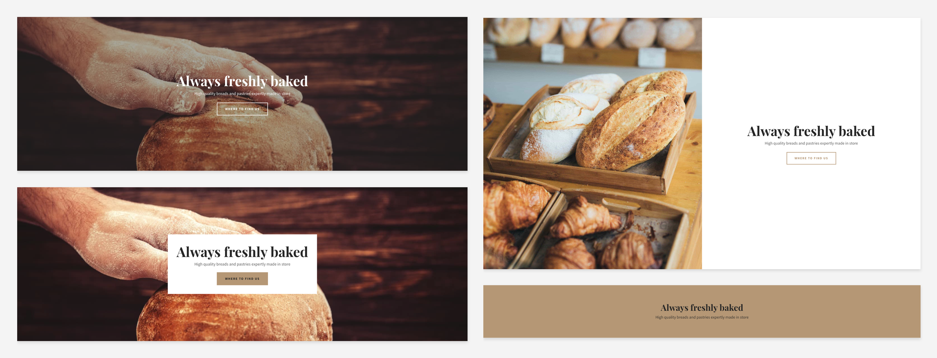
Hero section

The hero section is just as important as it sounds! It’s generally the biggest, most impactful thing people will see when they first enter your website, so it should contain key information, such as your company name, a short strapline and the most relevant call-to-action buttons, such as ‘Shop now’ or ‘Contact’.

Image and text

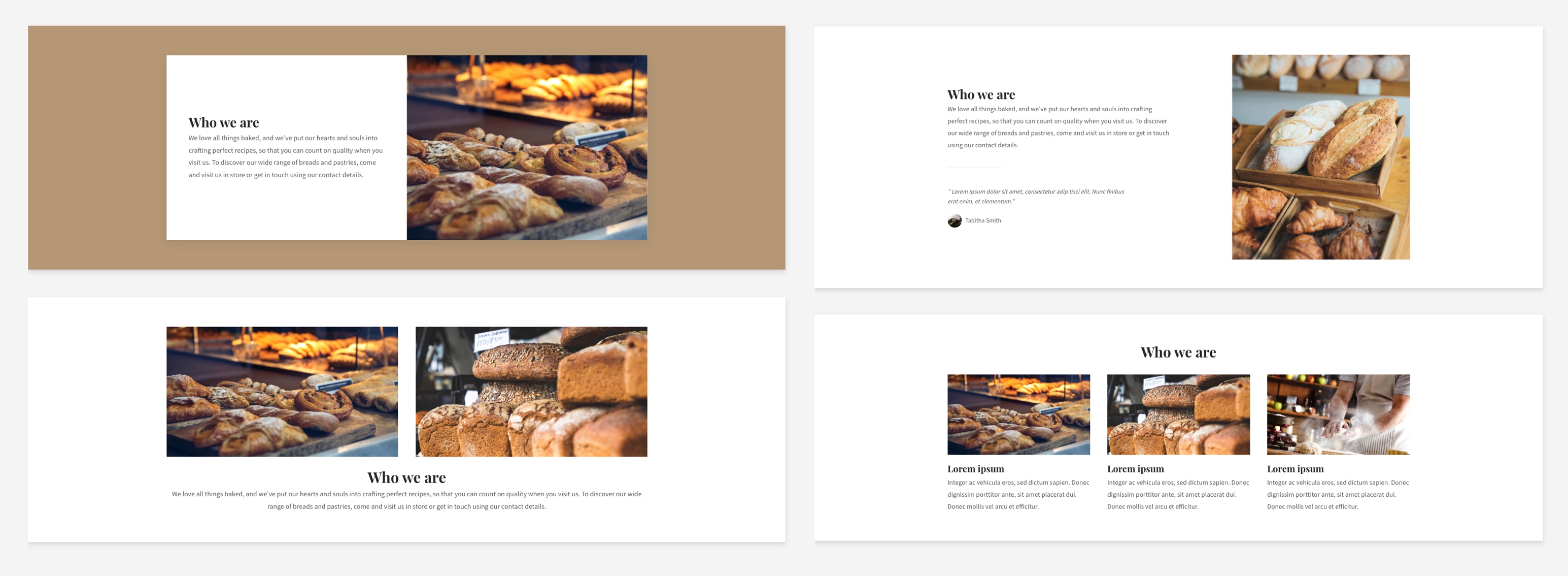
Image and text

This one does what it says on the tin – it allows you to add an image/text combination. This is great for when you want to show an image of what you’re writing about, or just for keeping a page visually engaging. If it’s the latter you’re aiming for and you don’t have a specific image in mind, this is a great place to make use of our stock image library.

Text

Text

This category covers many types of text, from paragraphs to headers and more, allowing you to really add personality to your website. Whenever you want to add some text by itself, this is the section you’ll need. You can customise it completely, from font to layout, and – most importantly – content! Take a look at guides like this for more advice on creating great content. 

Image

As with the text section, this is for when you want to add an image by itself. This could be a photo of your products on your homepage, a photo of you on the ‘About’ page or a (relevant) stock image to break things up. Studies show that images are a great way to keep things engaging, so image sections will allow you to do just that.

Gallery and slideshow

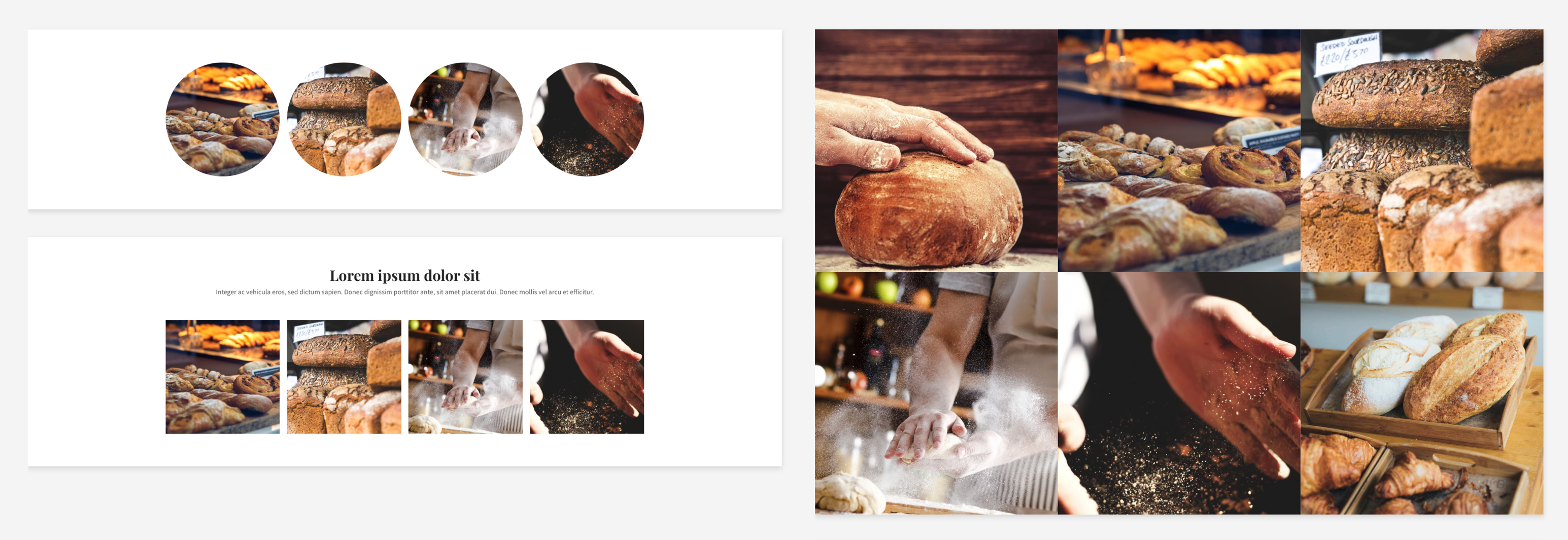
Gallery and slideshow

Especially good for showing off products or behind-the-scenes action, we have a range of different gallery and slideshow sections, so you can choose your favourite eye-catching display format.

Form

A great way to keep people updated and engaged is to create a mailing list. Putting a simple signup form on every page will allow them to add their email address in seconds. You can also add a larger form, allowing people to contact you with questions.

Contact

Contact map

You can provide as much or as little information as you like with a contact section. If you have a bricks-and-mortar location, the map feature will help people to find you, while email address, phone number and an additional contact form can all provide easy ways for people to get in touch.

Promotional

Highlight your store, products or special offers with promotional sections placed anywhere on your website. This is a great way to grab people’s attention while they’re browsing!

Social

Social media and a website are best when used together. Make sure people can find your social media easily with social sections. You can also use this to link to reviews on sites like Yelp.

Page title

As you might guess, this section lets you name each page. It almost always makes sense to have this at or near the top of your website. You can easily customise the fonts and colours here to go with the rest of your website and branding.

Video and audio

Video and audio

Using video on a landing page can increase conversion rates by a massive 80%. Easily include videos, with or without an introduction. If you have a YouTube channel, you can include your latest videos, or you can include a video of your products in action to show them off in your store.

Files

Anything people need to download from your website, from forms to instruction guides, can be included in this style of section. You can either put it right after the mention of a file or throughout the website to encourage people to access it.

Embed

If you have any code you want to include to add custom features or third-party services (like SoundCloud or booking forms) to your website, this is the section you can use. As with other sections, it can be placed wherever you want. The possibilities are endless!

Logos

Logos

Include logos anywhere on your website to show off partnerships, products you use or companies you’ve worked with. This is a great way to build trust!

Store

If you have an online store on your website, sales-boosting sections can make all the difference. Featured products and ‘basket’ sections are a great way to get people engaged and to turn visitors into customers! It’s often a good idea to place these at the top for easy access, but you can experiment with different placements and see what works best for you.

PayPal

Our PayPal sections make it really easy for your customers to purchase from your store. With different design options, you can make these sections fit in with your website’s overall look.

Blog

Feature your latest blog posts anywhere on your website to capture people’s attention while they browse, so they never miss an update.

So there you have it: a guide to all the sections you need to create your perfect website! We’re always listening to feedback and adding exciting new things to our website builder, so we’ll be sure to keep this guide updated as this happens. If you haven’t created your website yet, why not try a free trial? Happy sitebuilding!