You’ve come to make your website and you want it to stand out and look professional, modern and stylish, but you know you don’t have the time to design a website from scratch. Don’t worry, we’ve got you covered with a list of some of 2020’s latest web design trends that are easy to implement in your website builder.
Vibrant colours
Don’t be a shrinking violet! Using big, bold colours will help your website stand out, but make sure not to use too many at the same time – neon yellows, pinks and greens all together will be a real shock to the senses! Instead, choose one or two vibrant colours – preferably one that is in your logo or part of your brand identity, and then use a muted colour of text to complement it, like Cyclemon have done on their website. If you’re not sure what colours to go for, try a colour palette generator like Coolors to give you inspiration.
This adds visual interest, and makes it more likely that people are going to remember your brand. The most important thing to remember, though, is that this is really dependent on your company and what you’re trying to promote – a lawyer’s website might want darker and more professional-looking colours, whereas an events site that organises festivals can go wild with a rainbow of hues. Make sure you are accurately representing your brand to avoid a sense of disconnect between your site and the services you provide.
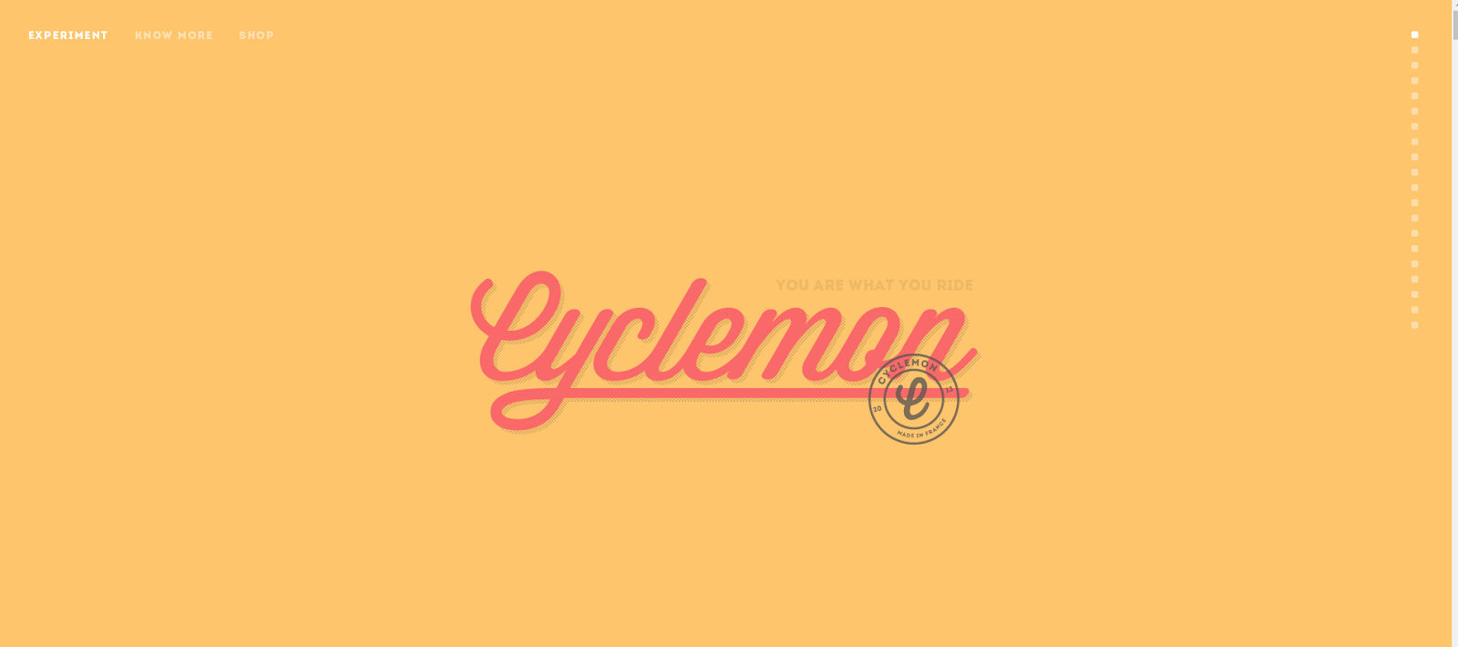
Cyclemon use a bright yellow background with a complementing red for their brand title, but the rest of the text is in muted colours.
Gradients and duotones
Still thinking about colours, now we’re talking gradients! For those who spent hours deliberating on which colour gradients to use in their powerpoint presentations in IT class at school, it has a retro feel. Now though, these gradients are getting a modern twist with futuristic colour themes, like blues, purples and hot pinks.
Play around with radial (circular) or linear gradients, or have more than one colour like Spotify. This is a simple and effective look, as you don’t need super high-quality images; the colour does the work for you.

Spotify’s homepage uses a radial gradient from left to right that fades to black at the bottom.
Enhanced images and filters
Images are extremely important when it comes to websites. They have to be good quality, well composed and represent your brand, but for 2020 you can go a little further.
To make your images stand out, you have different options. If you’ve already got a vibrant colour background, why not make your photo monochrome to make it stand out? Another trend is images that are in a shape, like a circle or a triangle, that you can layer with other elements on your page.
The simplest way to get your image to stand out is to add a filter. You can overlay the image with a colour – the colour of your brand, perhaps – or just a colour that represents what you do most.
We love this Go Sitebuilder website example, where Polly Evans Hypnotherapy have put a muted filter on a vibrant image to emphasise the sense of calm their hypnotherapy will bring to clients.

Polly Evans Hypnotherapy does a great job of adding a filter to an image to represent her brand.
Dark mode
It’s not as scary as it seems! Dark mode, simply put, is having a dark background with light text, as opposed to the standard mode on your phone or laptop that usually has a light background with dark text. Dark theme on screens reduces eye strain and extends a screen lifespan, and as more devices are giving users the option to enable the dark theme, people are getting used to it.
The good news is that using a dark mode colour theme will help your design elements stand out more by making them contrast more. Black and white is an obvious choice, as displayed beautifully here by design studio Wonderland, but feel free to play around with it – what about a navy blue background with pale cream text?

By having contrasting white text against a dark background, Wonderland’s message really stands out.
Extended white space
Another trend that is really gaining traction this year is the use of space. It’s easy to think that an area of white space looks unfinished, or messy, but in fact it adds to a minimalist charm that is growing in popularity.
Rather than using five photos, really think about what you want to show your users and try and limit it to just one or two on the homepage. This shows that you’re not trying too hard and that you’re confident that these pictures show the quality and style of your work. It will also prevent the user becoming overwhelmed when they arrive on your site. You can do this with our website builder; have a look at MND Tee that does a great job with managing white space.
![Screenshot of MND Tee website]](https://lh3.googleusercontent.com/IfrdnHa5Ntw14DlAgT0kTxfK4-Tk61WrRQ-wf-_nwU5J7yYi4iQS8NAFI_oLVjSeETxi7wUvYICHPFCi9C1AptxERMwyeEDqdlcpcREPTv1GoBoPGkI2UoGRVAHJhhMBzIaBmPHU)
The white space on each side of the images draws the eye to the centre of the site.
We hope this has helped you with some ideas on how to make your website look on trend for 2020! With Go Sitebuilder, we have ready-made themes to help you choose which one represents your brand best, colour palettes to help you create a stylish look, and an in-site image editor so you can really make your images pop!
Try our 14-day free trial today to see how our website builder can make your website building experience quick, simple and – most importantly – on trend.