How Can Law Firms Make Their Website Elements More Engaging?

Young and charming businessman is thinking about how can Law Firms Make Their Website Elements More Engaging

People want professionalism, accuracy, and consistency from the law firm that they’re going to trust to handle their legal affairs. This means that a polished, informative layout is all the more important for law firms’ websites than the average personal platform. An engaging site that reflects the quality of your service is key. You already know that you’re going to be giving your clients excellent legal advice, but they don’t!

We know that lawyers are usually busy with cases – they don’t have the time to spend hours building their own website from scratch. But by using a website builder such as Go Sitebuilder, with simple to use features and ready-to-go templates, you can quickly create a professional website that suits your branding.

If your website is the first part of your firm that clients see, you’re going to want it to convey your credibility, solid expertise, and importantly, stand out from competitors. Creating an engaging website is crucial to this, and making some small changes to make your website more effective should not be overlooked.

Choose a website builder that can handle web design

Aside from ensuring that your content is accurate and free from typos, one of the most important (and easy!) ways to improve a lawyer’s website is to turn your thoughts to your web design and make your website elements more eye-catching. This is simple to do with the help of a website builder that can handle the trickier aspects of web design like Go Sitebuilder, which lets you use different elements to highlight important aspects of your page. You’ll be able to create a striking website with infographics, images, and videos to suit your needs, with no prior design or coding experience required.

Use infographics to complement your legal advice 

Including legal advice on your website is a good idea that can be useful for potential clients, and shows that you want to help inform the public. For example, using facts and figures in an infographic to highlight a legal fact, such as the number of people that could be accessing a given legal service, will jump out to people visiting your page and may resonate with potential clients, highlighting the relevance of your firm to their legal needs.

Graphics can also be a great way to showcase personal testimonials to the quality of your service and references from large companies that you have helped in the past. This will add to the reputability that you convey to prospective clients, and give them confidence in the services that you can provide. In fact, law firm marketing company The Modern Firm’s research shows that the testimonials page is the most clicked on part of any law website. Big names and complimentary remarks can stand out much more effectively in a nice graphic, so make sure to include them on your website.

Use images for trust and credibility 

Include photos of the practicing paralegals, lawyers, and partners at your firm to add an approachable touch to your website. People value transparency from their law firm and want to know what they’re getting. By including a ‘who we are’ or ‘meet the lawyers’ page, you’re letting your clients put a friendly face to a name.

You’re inevitably going to be meeting your clients face-to-face. By showing the lawyers working at your firm, their qualifications and areas of expertise, not only will clients get an idea of who may be the best person to handle their case, they’ll know who to expect when they walk into the office for their consultation. People are attracted to companies with a human touch. Show your clients who you are, stand out from competitors, and let them envision working with you!

Add videos to inform and explain

By adding a video to your website, you can take this personal touch even further. Hearing you explain your services or the steps within a legal process can instil confidence in potential clients like nothing else! A well-edited, professional video showing your team articulating themselves clearly on relevant topics, thus evidencing a thorough grasp of their areas of legal expertise will make a client’s decision to work with you easier. It may even be able to answer some of their questions before they make the call or step into your office. This kind of video content can result in people staying on your website for 60% longer than if you had no video content at all, so it’s a good idea to invest some time in this area. 

A variety of informative videos, and infographics can give potential clients a greater understanding of the legal process, provide clarity on their concerns and influence how they approach you, ultimately making your job easier. Whether you’re an established firm, just starting out, or if you are thinking about making the move to becoming a freelance lawyer, having a website is proven to be a powerful business tool.

Have a look at our blog on why lawyers need a website to read more about the benefits – or why not register for a 14-day free trial with Go Sitebuilder, and see how our features can make your professional legal website the most appealing on the web!

What are the best restaurant websites for design inspiration?

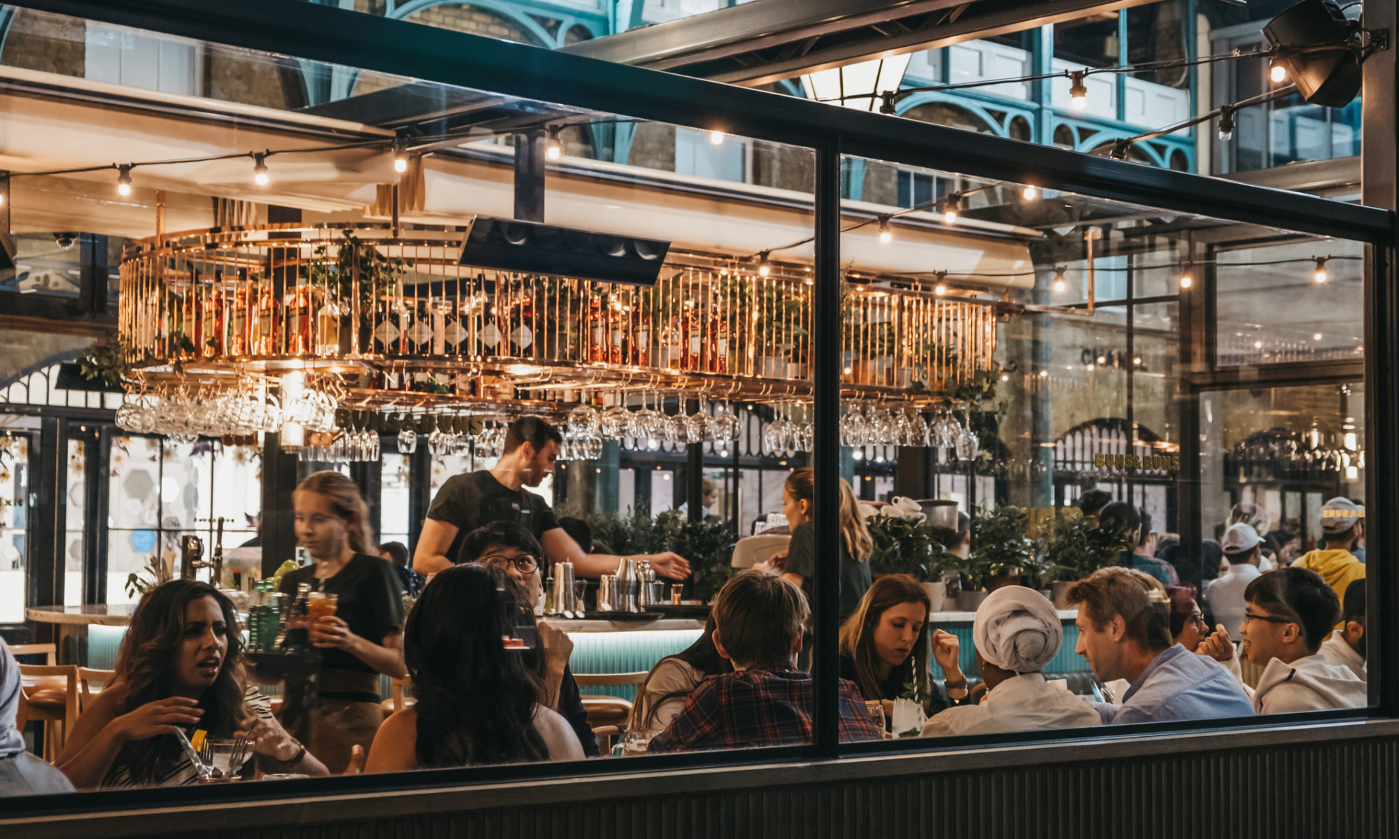
Customers inside a restaurant discussing the best restaurant websites designs

Having a strong website design is key for all online businesses – considering that 38% of people will be put off a website if the content is unattractive, it is vital that your site design is aesthetic so you capture the visitor’s interest. This is even more crucial for restaurants: if your website isn’t visually appealing, then the user is more likely to form a negative impression of your restaurant, which means they probably won’t want to visit your establishment. 

Nevertheless, this doesn’t mean that you have to have the skills of a top website designer to build a website that reels visitors in. We’ve broken down some of the best ways to build your own website for your restaurant, so that you can get some design inspiration. 

Strong colour pattern 

Source: Between The Bread

This restaurant has used bright, bold colours of its foods, and displayed them on a contrasting background. By using colours that pack a punch, the visitor is immediately drawn to whatever you want them to see first – in this case it’s the food! Using a variation of colours means your landing page stands out, meaning your website is more likely to stick in the minds’ of those who visit your site. However, it is important not to overload your website with colour, as this can lead to confusion: this restaurant has focused on reds, yellows and greens, telling the visitor that they can expect vibrant, colourful foods.

Focus on font

Whitmans text with burger

Source: Whitmans New York

Whilst a picture might speak a thousand words, the type of font you use also sends out a certain message. Here the casual, relaxed font suggests that this restaurant has more of a laid back atmosphere – the flavours are bold, but the establishment has a more chilled vibe.

Informative

man in kitchen making pasta

Source: Pastaria

Providing key information on your business, which can be clearly seen, is essential when you build your own website. According to KoMarketing, 44% of website visitors will leave a site if there aren’t any contact details. Providing the site users with contact information that they can clearly see, and giving them an option to contact you to make queries or reservations is essential. Considering that most people will make a booking with your restaurant either by phone or online, it is key that you make this process for them as easy as possible.

High quality images

filleted fish

Source: Catch

Using a high quality image, which isn’t blurred or poorly lit, shows just how professional your restaurant is. Considering that high quality images are a crucial factor in helping to sell your product – or restaurant – the best way you can create a good impression on someone is by using images which have been professionally taken. It’s important not to overcrowd your site with images too – just like this restaurant has done, keep things simple to achieve a sleek, attractive finish to your website design.

Appetising 

flatbreads on rustic table

Source: Lemonade

Of course, as a restaurant, if there’s one thing you want to get right, it’s how you present the food that you sell. People will want to come to your restaurant if you prove to them that you can serve them dishes which look great, and taste even better. As they obviously can’t sample the food by looking at your online business, they have to sample it with their eyes instead – capturing your tastiest dishes in a way that shows them off in all their glory will push people to make a reservation with you. 

Less is more

three juice bottles

Source: Foster Juice Co.

As you can probably see so far, these restaurants have stuck to a simplistic style of website design. Whilst some have taken the less is more approach more seriously than others, it is clear that these site designs have avoided overcrowding the landing page with multiple different pictures or crazy colour schemes. Instead, they’ve allowed the colours to bounce off each other to create a visually appealing effect. By holding back on wild, clashing colours and over the top images, you can build a website which delivers a pleasant site user experience. 

Atmosphere of the restaurant 

plates of mexican food

Source: El Burro

What kind of dining experience can your customers expect? When searching for a restaurant, people normally type in words that describe the type of restaurant they want to visit. Your website design must reflect the atmosphere of your restaurant, so that the user has some idea as to what kind of experience you are offering – here the bold, bright colours and rustic looking foods of this restaurant’s website design suggests they are a more casual establishment.

Welcoming 

Most importantly, your website should be welcoming! You want to create a positive image of your restaurant which sticks in the minds of site users. With Go Sitebuilder’s ready to go site, creating a captivating website design couldn’t be more simple. Or, if you find yourself completely pushed for time when you’re first building your website, why not browse our free stock photo gallery, so that you can use professional photos, completely free of charge?

Try Go Sitebuilder today; our free 14-day trial gives you the ultimate freedom to design the perfect website for your restaurant!

How do you introduce a current website to social media?

Happy smiling black woman using smart phone. Thinking about how she can introduce a current website to social media

So you’ve already set up an amazing website but are yet to connect your website to your social media. Creating an integrated online presence for your business will drastically improve interaction with your business, on your website and on your social media platforms. 

The most important aspect of integrating your online presence is to ensure you have a strong website. Using a website builder such as Go SiteBuilder can be a really useful way to ensure that you have stunning web design and an effective layout. Make sure all pages of your website are finished and you have added all the information you need to before you start to introduce it to your social media. 

Use your social media presence

If you already have a strong social media presence then introducing your website to potential new customers is much easier. A strong social media presence is indicated by a high number of followers and engagement levels (i.e. followers like and comment on your posts). If you have a strong social media presence there is a higher chance that followers and others will visit your website once you integrate it into your social media platforms. 

However, if you do not have a strong social media presence already there are some ways you can easily improve it. Social media is extremely important in growing your business; with over 3.48 billion users across social media platforms such as Facebook and Instagram, creating a presence is vital to access such a large market. 

Ensure you have social media accounts across multiple platforms, whether you pick two or all social media platforms. Think about what you post and how often you post, as this will increase engagement. For more tips check out our blog on how to create a social media marketing strategy.

Ensure you link your website correctly

This seems like an obvious step but many social media platforms fail to put the correct links in the right places for their website. Your website’s homepage should be linked in your ‘bio’ or ‘profile’ depending on the social media platform. Remember that on Instagram you can’t add links to separate posts, so you need to make sure the link is in your bio. 

If you make a post about a specific part of your website, for example your gallery page, make sure you put a link to your gallery page in the description. Although this will not appear as a hyperlink on some social media platforms, having the link is still very important as users can copy it and find the page your post is about. 

Launch your website

Even though your website already exists, having some kind of recognition on your social media is really important. You may wish to launch your website as if you have just published, if so check out our post on how to launch a new website on social media. However, if you want to create more of an integrated ‘soft launch’ to your website, this can be done in a number of ways, for example:

  • A post dedicated to each section of your website – include screenshots of your website 
  • Reviews of your website/comments on your website 
  • Tips on what website builder you used or how you created your website
  • Showing any new changes you have made to your website 

Promote your website

Introducing a website to social media can be difficult, especially if you do not have a large social media presence. There are a variety of ways to promote your website. The easiest way is to ensure you use hashtags and location tags to your advantage. This means following trending hashtags and adding them to your posts when relevant. By using trending hashtags you increase the chance that social media users will see your posts. 

Location tags are a little different as they do not work for every business. However, for businesses such as photography, travel or fashion they can be a great way to promote your posts. This is most useful on Instagram, but can be used on other platforms. Users search for a location to see posts relating to an event in that area. Therefore, if your post is featured among others in this location tag then more people will see your posts. 

If you’re ready to build an amazing website for your business, then look no further than Go Sitebuilder. With a wide range of features, our simple website builder design means you can have a professional looking website up and running in minutes. Try our 14-day free trial today!

Why does an electrician need a website?

Electrician Installing Socket In New House and needing a website with Go Sitebuilder

It doesn’t matter if you’ve been an electrician for years or if you’re just getting into the trade, an electrical website will be a great asset to your business. It can bring in more customers, make you stand out against your competitors and boost your reputation – both online and in person. According to a Bright Local marketing study, more than 90% of consumers use a website to learn more about your services before deciding which business to use, so getting a website up and running is paramount. 

If you’ve been put off from getting a website because it seems complicated, or you have no design or coding experience, don’t worry! Choose a website builder like Go Sitebuilder which has ready to go web designs specially designed for your industry, and all you have to do is upload your images and content and you’re ready to get online!

Let’s take a look at why you need a website and how you can capitalise on yours to grow your electrical business.

You reputation is based on your web design

A Blue Corona study revealed that 75% of people judge the credibility of a contractor based on their electrical website design. This is a huge proportion of people, and so your web design has to be professional and stylish. 

By using one of Go Sitebuilder’s web design templates, most of the work is already done for you. You don’t have to worry about whether your colours are clashing, your fonts are distracting or your text is overwhelming – we’ve done it all for you!

A few tips to get the most out of your electrical website’s design; make sure you use high quality and relevant images, that your navigation is clear and easy to find, and that you have a clear call to action on the homepage. For more inspiration have a look at our blog posts on web design, but don’t overthink it – simple is better. 

Showcase your expertise

People are going to visit your website to decide whether you are the person they want to fix their electrical issues, so you have to show them why you are better than your competitors. One way of doing this is highlighting the qualifications you have, and any areas you specialise in. 

This makes it much easier for a potential customer to choose you; if they have an issue with electrical wiring in Victorian homes, for example, and you have a specialised qualification in that area, then they are much more likely to decide that you are the best option. 

By showing that you not only have qualifications, but that you also update your skills with training courses or workshops on a regular basis, you can also stay ahead of the competition. 

Get your electrical website in front of the right people

Being an electrician requires you to travel and visit people’s houses, so where you are based geographically is extremely important. There is no point in your beautiful designed website coming up on people’s Google searches if they live 500 miles away. So what can you do to stop this happening?

Registering your business on Google My Business is a great way to make sure your website gets in front of the right people. This means that when people google “electrician near me” your website will come up in the business section, along with your contact details, reviews and images. This streamlines the process of reaching out to customers and is a great way to raise awareness of your business in your local area – sixty-four percent of consumers have used Google My Business to find contact details for local businesses. 

If you have any questions about doing this, have a look at our blog on how to get your business on Google. 

Show the value your work

One of the most important parts of any electrical website is the testimonials page. This is where previous customers can rate your services and leave comments about the work you did for them. This might seem like a lot of work but it is a fantastic way to foster trust with potential customers; the majority of people will rely on testimonials when deciding on which electrician to go with. 

It’s also a good idea to link out to third party listings like Yelp and Angie’s List so that your website address is visible on other websites, not just your own. 

Rather than just relying on other people’s opinions on your work, prove that you take pride in your electrical expertise as well by offering personal or professional guarantees. This is another way to give yourself an edge over the competition in your area and is likely to inspire trust in your customers. 

There are so many good reasons for you to have an electrical website, why not make one today? With Go Sitebuilder you can have a stylish and professional website up and running in just a few minutes, with a personalised domain name and five contact email addresses. Try our 14-day free trial today to see what we can do for your electrical business!

How much does it cost to make a website for a small restaurant?

Diverse small group of four attractive laughing friends having wine and a meal together in restaurant talking about how much it cost to make a website for a small restaurant

Did you know that 62% of diners research restaurant choices online before dining out? Having a website for your restaurant is of paramount importance and in a previous blog we looked at why you need a website for your restaurant. Whilst you might understand why having a website is key for your restaurant, you might be a bit apprehensive about the costs of building a website. 

Although there isn’t a set price when it comes to building a website, there are multiple different routes to take, and some are cheaper than others. If you have the time and the necessary knowledge, you may want to build a website from scratch, or you may opt to enlist the help of a website builder, such as our simple, easy to use site builder, for a quicker and simpler option. We break down the costs of these two choices, so that you can build your website with a rough idea of prices. 

Building a website from scratch 

Web hosting 

If you’re building a website from scratch, you’ll need to find a web host, as it is a service that will allow you to post your website onto the internet, and in turn, lets others find you on the internet. Of course, this is vital to attract new customers – if potential site traffic can’t even find your restaurant on the internet, then you’re not going to be able to entice any potential customers, regardless of how appealing your web design is. 

The costs of web hosting can cost anything from a couple of pounds a month to £700 a month. If you want to find the cheapest option, then shared hosting is your best bet – however, as numerous other websites are sharing the resources of a single server, your site can become slow and more difficult to use. If you want more control over your server, dedicated hosting gives you your very own server, although it is the more expensive option. 

SSL certificate

An SSL certificate is an important feature for your restaurant’s website: as you’ll be taking bookings via your website, you’ll need to collect personal information from site users. As an SSL certificate ensures that any information stored on your site is protected from potential site hackers, having one helps to build trust between your website and a potential customer. 

Again, the cost of a SSL certificate can vary quite widely, depending on the scale of your business. If you’re building a website purely to take bookings, then you could be looking at a cost of roughly £50 a year for your SSL certificate. However, if you’re building an ecommerce website for your restaurant to sell products that you make, you may want to have a higher level of protection, as your customers will be handing over their bank details. This could cost you anything from £90 to over £200 a year. 

Web designer 

Part of the attraction of a restaurant is its aesthetic appeal – in fact, there is a complete psychology behind what pulls us into a restaurant. This means that you’ll want your website to look as good as your restaurant itself: if you have a bad web design, it sends the message that your restaurant is similarly of low quality. 

For a beautiful, sleek web design, you’ll probably want to enlist the help of a web designer to ensure your website looks stunning. The price of hiring a web designer is relative to their level of expertise – you could be looking at a cost of anything from £10 to £150 per hour. Ultimately, the choice of how much money you’re willing to invest into your web design is up to you. 

Using a website builder 

Costs of website builder 

With a website builder, you’re required to pay a set subscription fee a month, which can go up if you require additional features for your website. Although you have less control over individual costs with a website builder, website builders will include the aforementioned within their packages and more. Not only do the prices often work out cheaper than if you were to build a website from scratch, but it also saves you the time it would take to build a website without a website builder. 

Of course, you’ll still have to factor in additional costs of hiring a photographer if you want to upload clear and professional pictures. This is extremely important for a restaurant website, as users will be attracted by the look and design of your restaurant as well as appetising pictures of your food. If your pictures are badly lit and obviously unprofessional, this will quickly put potential customers off. 

At Go Sitebuilder, we have ready to go templates especially designed for restaurants so you can easily upload pictures of your stylish space and delicious menu and have a smooth and sophisticated web design up and running in minutes. To find out more about everything we offer in our affordable, yet high quality, package, try our 14-day trial today!

What are the best event website designs?

Senior stylish woman taking notes in notebook while using laptop at home on what are the best event website designs

Do you have an events website that is in need of an update? Or have a flourishing events business but not sure how to build a website? Then look no further! Here we are going to give you the best web design inspiration for your events website. 

Often when businesses start creating a website they start with a website builder. Website builders are a great way of easily building a website for a low monthly price. Go Sitebuilder has a wide range of templates and design ideas to help you decide what is right for your event management website. 

With technology becoming increasingly important in marketing events, having an up to date website is vital. In 2019 52.6% of event professionals increased their spending on technology, proving how important investing in technology is. 

Large professional event website: Telegraph Events

Source: Telegraph Events

This beautiful website is for events hosted by the Telegraph. The layout is simple and easy to navigate using a header as the main navigation tool. The use of dark colours and white writing creates a striking web design. The use of the large picture below the header gives a sense of the type of events they hold as soon as you enter the website.

Foodie festival: The Big Grill Festival

Source: The Big Grill Festival

This bright web design is extremely effective at communicating the spirit of the event and clearly showing what the event is about. The cartoons at the top of the homepage show music, chefs, drinks and bright colours. The simple header allows visitors to easily navigate around the website and simple icons for each social media platform is also very effective. 

Music Festival: Coachella

Source: Coachella

As one of the biggest festivals in the world Coachella has a professional well designed website. The image above is what the homepage looks like once the headings are clicked. As you can see the menu then drops down and there are simple headings to follow. 

However, what is really effective is the small drawings that accompany each menu dropdown, this one being sunglasses. The subtle colours and minimalist design create an aesthetic that matches what you envision when you think of coachella. 

Conference event: Circles Conference

Source: Circles Conference

This homepage for Circle Conference is highly effective and creates a significant impact on the visitor. Immediately you are struck by the bold blue colours and large writing. All the key information is displayed on the homepage, giving a date for the event and the type of conference. Although the menu is somewhat hidden, the two lines in the left hand corner indicate there is more to find out. 

Best use of colours: Image Festival

Source: Image Festival

This bright bold design is slightly different from those mentioned before. This website for an art festival in Rotterdam has a creative slightly vintage feel, with pastel shades and a typewriter style of font. Although the website is slightly crowded with information the menu is clear and the side bar allows more information to be shown. 

Key points to think about for your event website:

So now that you have seen some great examples of web design for events websites you may be thinking about designing your own or updating a current website. Before you do, consider the following points:

  • What style of website do you want? – a minimalist approach or more content on the homepage.
  • Make sure visitors to your website know immediately what kind of event you are holding.
  • Consider the fonts and colour scheme – these must match with the aesthetic of your event and also show visitors what kind of event you are having. Take a look at our blog on how to make your website more visually appealing
  • Consider what kind of photographs/drawings you want to showcase your event. 
  • Ensure you have all the key information on your website and that visitors can find the information easily. 
  • Find a website builder that is easy to use and has a wide range of customising options.

For more information, check out our blog on how to create a successful events website.

If you are ready to start building your events website, then look no further than Go Sitebuilder. With a wide range of features including a range of design templates, our simple website builder design means you can have a professional looking website up and running in minutes. Try our 14-day free trial today!

How do I get my new website noticed?

Male photographer on a laptop making a website

There are few things more upsetting than spending the time to make your website look beautiful and then realising that nobody is visiting it! But don’t worry – this happens to the majority of small businesses as they find their feet in the digital world, and there are multiple ways to get your new website in front of as many eyes as possible. Using a website builder like Go Sitebuilder can help you create a professional-looking website simply and easily, so you don’t spend too much time on the web design and can focus on the more important parts of your business. 

Unless people have your domain name noted down somewhere, the way they are most likely to find your website is through a search engine. Google is by far the most popular, with over 70% of the world’s online searches going through their site, and we are going to look at some Search Engine Optimisation (SEO) tricks that will help Google both see your new site and rank it higher than others. 

Get your new website indexed by Google

When you first click “publish” on your site, you might find that it doesn’t come up when you Google it. This is because Google’s crawler bots (which read your site and decide where it should rank) haven’t got round to indexing your site yet. This means the only way to find it is to put in the exact domain into the search bar on your internet browser. 

There is no set deadline that Google says it will index your new site by when it has first been published, but the average time is from four days to four weeks. However, there are a couple of things you can do to make it easier for Google; you can verify your site on Google Webmaster Tools, and submit your site to Google. We are going to look at other ways to make your site rank better on Google below. 

Research and use keywords on your new website

What is your company about? Brainstorm some words that accurately represent your company and the products or services you provide, so that when Google indexes your site, it will be easy for it to know what your new website is about. It’s a good idea to focus on a niche here, rather than something very broad, as it makes it more likely to stand out against the competition. 

Research the keywords you’ve come up with and run them through Google Keyword Planner; you want to use keywords that are high in search volume (so lots of people search them) but low in competition (so not many other websites are using them). This way, Google’s crawler bots will see your site as more relevant and rank you higher for those specific keywords. 

Create unique content

The content you have on your site, whether that is your web copy or your blogs, has to be unique and not copied from another site. This may seem like a no-brainer, but Google has indexed hundreds of millions of websites and can immediately tell if you’re copying and pasting from another source, and will penalise you for it. 

The best way to do this is to create a blog. This is a double win, because if you publish content regularly, then Google will re-index your site regularly, and rank you higher for being up to date. It is also a good opportunity to get backlinks, which is where external sites link back to your website because they value your content. Look for fresh, interesting ideas and unique ways to approach common issues, and put in the time to create content that is valuable both for your new website and your audience. 

Get your own url and publish it everywhere

This is not a moment to hide under a bushel! Take your new website’s domain and add it to your email signature and your business cards. Upload it on your Facebook, Twitter and Linkedin profiles, and get friends to link their contacts to it as well. 

Although it may be tempting to start your new site with a free website builder, they are unlikely to give you your own domain name, instead giving you a long and complicated url like this: www.websitebuilder.com/yourname/yourwebsitename. Difficult to share and even harder to remember, this is a sure-fire way to show potential visitors that you are not committed to your new website. With Go Sitebuilder, we not only give you your own domain, but we also give you five personalised email addresses to make you look even more professional. 

Getting your new website noticed can be difficult because there are so many sites out there! But if you do your keyword research and put some time and effort into creating high quality unique content, you are well on your way to having a Google friendly website. And don’t forget to advertise your site wherever you can!

If you’re still looking for a website builder with excellent web design that needs no coding experience, we designed Go Sitebuilder especially for you! Our ready to go web design templates mean you can have a stylish and professional new website up and running in moments. Why not try our 14-day trial today to see what we can do for you and your business? 

What are the different navigation options for a website?

A male and a female sat at desk, looking at a laptop. The male is wearing a red hate and pointing to the laptop. The female is looking at the male.

Navigation is an incredibly important aspect of web design. Navigation refers to how visitors move around your site, whether this is through links or a menu. If the navigation on your website is too complicated visitors can be put off exploring further around your website. If you need more convincing check out our blog on why navigation is so important.

There are a few different options when choosing the type of navigation you want. Often this is a choice between menu styles, but there are other ways in which good navigation can improve your website. With such a range of templates and layouts that come with many website builders, it can be difficult to choose the right one. With Go Sitebuilder we want this choice to be easy, so read on to find out the best navigation style for you. 

Header Menu

Website builder homepage showing video and navigation bar
Source: GoSiteBuilder

The first, and most popular, style of navigation is using a header menu. As you can see on our website this is the style we opted for. A header menu gives the visitor a clear range of options as soon as they enter the website. This means that there is no additional searching for a menu option, making this style the most simplistic. A recent study found that header menus are 22% quicker to navigate than other menus. 

Some header menus are static (meaning that they stay at the top of your page as you scroll), whereas others move off the page as you scroll. Neither option is better or worse, but having a static menu means visitors can change pages easier. Often these headers have between 5-7 options to click on, more than that and the web design starts to look cluttered.

Pros of a header menu: 

  • Visitors can easily find your menu
  • Easy to organise your website into specific categories 
  • Gives structure to your website 
  • Allows visitors to quickly move between web pages 
  • A very popular web design trend – for more web design tips read our blog on the latest web design trends

Cons of a header menu:

  • Takes up space on your website
  • Can be difficult to translate into a mobile format 
  • Some prefer a more minimalist homepage with a smaller menu

‘Hamburger’ Menu

Event website homepage showing a hamburger menu]
Source: Circles Conference
events website showing drop down menu
Source: Circles Conference

The ‘hamburger’ menu is often represented by 2 or 3 lines. When the lines are clicked on, the menu opens into the website, as you can see above with the Circles Conference website. Although this option is used less, there are still positive aspects to this design. 

The main reason this is chosen over a header menu is that this design is more minimalist and takes up less room on the homepage, which leaves more room for a bold header, as seen in the images above. Also, as this menu opens out there is more space and there can be more sections of the website. If you have lots of navigation options, a header menu can look cluttered, so a hamburger menu could make your web design look more streamlined. 

Pros of a hamburger menu: 

  • A more minimalistic look
  • A larger range of menu links 
  • Easily transferable to mobile websites 

Cons of a hamburger menu:

  • May be harder for a visitor to find the menu if they don’t know what the symbol means
  • Visitors have to spend more time finding your menu

Drop Down Menus

Source: Asos

This option is often used for online shops as visitors may want to find a specific item. This example of the Asos website essentially has three menus. The first is the option between Women and Men, then they categorise the product by general product type such as clothing, then more specific fits or clothing types. This allows for multiple options when organising your website. 

However, unless you need lots of options an overly organised menu may distract from the content of your website. For example an accounting firm would not need as many options as a site such as Asos. 

Pros of a drop down menu:

  • Site content can be organised into more specific categories
  • A good way to organise for e-commerce sites
  • Gives structure to your website 
  • Visitors can easily find the menu and navigate through your website 

Cons of a drop down menu: 

  • You may be tempted to make too make categories and over complicate your website navigation
  • Not every website needs this many categories 

Whichever type of navigation you choose, remember these 5 assets of good navigation:

  • How quickly can visitors change pages? 
  • How easy is your menu to use?
  • Does the style fit with your web design?
  • Is it too complicated?
  • Can your navigation be translated to a mobile site?

If you are ready to start building your website, then look no further than Go Sitebuilder. We offer a wide range of features including a range of design templates, which give you multiple navigation options. Our simple website builder design means you can have a professional looking website up and running in minutes. Try our 14-day free trial today!

Do I need terms and conditions on my website?

Caucasian male with a long beard is sat at a desk in front of a laptop editing photos with camera equipment surrounding the laptop

If you’re building a website for the first time, it can be easy to get distracted with creating a beautiful web design, or creating a colour scheme that compliments your logo. We still find it hard to choose between our professional and stylish ready to go templates on our website builder!

But you need to be aware that there are some boring-but-important pages that you must include in your website. We’ve already written a blog on making sure you have a privacy policy on your website, but what about terms and conditions?

What are terms and conditions?

Terms and conditions are the small print that explain how your company works. They set out your rights and responsibilities as a business, as well as the rights and responsibilities of your customers. 

Ideally, a terms and conditions page should be no longer than two pages, and it should include:

  • The products and services you provide
  • The price and manner of payment accepted
  • Any guarantees or warranties you offer
  • Limit liability if there are any errors in your web content
  • Copyright and trademark information
  • Information on what happens when the customer wants to terminate service with you
  • Where your website is operating from and what the governing law is. 

Although terms and conditions are known for being difficult to read, you want to make sure that yours are plain and intelligible, so that both you and your customers can refer to them if any issue arises with your services or products. 

Do I need terms and conditions?

Although for many basic websites it is not completely necessary to have a terms and conditions page on your website, it is wise to have them, as it protects you from being held responsible for things that aren’t your fault. However, a terms and conditions page is required if you collect user data. Even if you just use your website for marketing purposes, there are still multiple reasons why you should think about having a terms and conditions page. 

Prevent people abusing your site

The terms and conditions page sets out the rules and guidelines your users need to follow to access your website and use your services. This can help prevent users writing harmful language or spamming other users on your comments or forum section. 

Make it possible to ban users if necessary

For websites that allow users to register to become part of the community or to access certain services, then it is a good idea to have a clause in your terms and conditions that allows you to ban them temporarily. This could occur if a user is being abusive on your website and is insulting other members. 

Make sure you own your content

The Intellectual Property clause is often included in a terms and conditions page, and this stipulates that you own the logo, content, and web design, and that this ownership is protected by international copyright law. This makes sure that nobody can copy anything from your website to replicate on their own site,  claiming that they weren’t aware that it was protected by law. 

Limit your liability

However many times you edit and reread the copy on your website, there are likely to be a few errors that slip through the gaps. That’s why many terms and conditions sites include a clause that makes sure that the owner of the website can’t be held responsible for errors in the content, or if there are accidental inaccuracies in the information presented. 

How to write terms and conditions

It might seem daunting to have to write the small print for your website, but you don’t have to do it yourself! Although many terms and conditions pages are very similar, don’t be tempted to copy and paste another company’s page and put it on your own. As likely stipulated in their terms and conditions, that would be classed as intellectual property theft. 

If you have a basic website that you are using as a marketing tool and that doesn’t take users’ personal information or payment details, then you can use an online terms and conditions generator where all you have to do is fill in certain information fields and it is created in a matter of moments. 

If your company is slightly more complex, for example if you have an ecommerce website or a subscription service, then it may be worth hiring a lawyer to write up your terms and conditions for you. This can be done fairly inexpensively using an online lawyer who specialises in this field, and will save you a lot of hassle in the long term. 

If you still haven’t decided on the best website builder for you, why not give Go Sitebuilder a try? We have an integrated ecommerce platform, and give you a personalised domain name and five email addresses, as well as many other benefits that make creating a website simple, fast and fun. Try our 14-day free trial today to see how beautiful your website could look. 

What’s the difference between local and global web design?

Pleasant conversation. Pretty young woman holding her kid while having telephone talk about the difference between local and global web design

If you’re building a website for the first time, or want to improve the web design of your site, you’ll need to work out whether you want to target a local or global market. Whilst it might be tempting to create a web design that falls into both of these categories, if you’re building a website from scratch for a brand new business, then it might be a good idea to focus your web design on just one of these categories. 

Go Sitebuilder offers ready to go sites which are completely customisable, so that you can build your website with a web design that perfectly suits your business, whether you’re aiming to keep it local, or to make it global. We take a look at some of the differences between local and global web design to help you decide which is the right web design for you. 

Colour scheme 

The psychology behind the colour scheme of your website is more important than you might think. According to TrueList, 42% of shoppers base their opinions of a website on the overall web design, and colour is an incremental factor when it comes to forming these judgements. When selecting the colour scheme for your site, think about what emotions you want to evoke, and what emotions the colours might inspire. 

If you’re building a website with the aim of targeting local customers or clients within your area, consider if there are any colours you can use that resonate with your locality. For example, if your town or city has a renowned sports team, you may choose to select a colour scheme which slightly mirrors the colours of that team. However, you also want to have a distinctive colour that resonates with your own brand – see if you can incorporate a colour which is unique to your business into your web design. 

On the other hand, if you’re building a website with the purpose of selling your products or services globally, you’ll want to pick a colour scheme which is more general. For example, some colours have negative connotations: in South Africa red is the colour of mourning, so you might want to opt for a more neutral colour scheme to ensure your web design is appealing to your global audience. 

Images 

Images also play an important role in the aesthetic appeal of your web design, as they not only add to the overall appearance of your site, but they help to convey a message. Using images is one of the quickest ways to communicate with your target audience – according to MIT, the human brain can process images in 13 milliseconds. That means it’s crucial to choose the right image for your website, as it is a great way to capture the interest of site visitors. 

If you’ve created a web design targeted at a local audience, one of the best ways to boost your image as a trusty, local business is to use local images. This doesn’t mean uploading a few snaps of some local landmarks onto your site – try snapping images of your products being used in a local area, or maybe upload a picture of your business collaborating with another local business. 

For a global web design, images of your local area are much less important: you don’t need to use images to highlight the fact  that you are a local business targeting local audiences, so you have more freedom in choosing which images to add to your web design. Use more general photos: stock images are a good way to add a professional touch to your website, without the cost of hiring a photographer. At Go Sitebuilder, we offer a huge range of stock photos to choose from, helping you build a website perfect for a global market within a few clicks. 

Content 

When building a website, your content not only conveys a message to your audience, but it also plays a big role in SEO, which affects your ranking on Google. You’ll need to decide how you want to structure your content for your web design: if your aim is to build a website for the global market, then you might want to focus mainly on keywords referring to the the products or services you sell, so that Google’s algorithms rank you higher on its search page results when someone searches for a specific item or service. 

If you’re a local business, you’ll still want to use keywords for your product, but you can also capitalise on local keywords, as it is fantastic for SEO: if you incorporate your location within your content on multiple pages then Google will rank you higher when someone searches for your products or services within the area. 

Whether you’re building a website for a local or global market, it’s important to find a website builder that is easy to use, but also offers quality services; Go Sitebuilder offers ready to go sites with completely customisable web designs, so that you can build a site that’s perfect for you. Our 14-day free trial gives you all the freedom you need to try our services, completely free of charge – try it today!